Branding for regional youth forum.
About
MOST is a regional youth forum that took place in Tomsk. It was the first event in a series whose main goal was to define the direction of youth policy in the region and to bring youth organizations together.
Tasks
Development of identity (logo, key visuals, branded elements)
Designing print materials (posters, banners, billboards, table tents, etc.)
Making layouts of stage banners
Development of merch
Making posts in social media
Making animations and stories
Identity elements
I used the bridge as a visual metaphor for connection and union. I created about eight logo concepts — here are my favourite variants.
" width="494.42397338867187px"><g d="M 0 204.486 L 0 0 L 494.007 0 L 494.007 204.486 Z M 181.445 55.693 L 181.445 184.825 C 181.445 194.86 173.297 202.965 163.262 202.965 C 153.228 202.965 145.079 194.86 145.079 184.825 L 145.079 54.664 C 145.079 44.628 136.974 36.481 126.939 36.481 C 117.676 36.481 110.043 43.428 108.928 52.391 C 108.799 53.119 108.756 53.891 108.756 54.664 L 108.756 184.825 C 108.756 194.217 101.595 201.936 92.418 202.879 C 91.903 202.922 91.388 202.965 90.874 202.965 C 90.231 202.965 89.63 202.922 89.03 202.879 C 79.852 201.936 72.691 194.217 72.691 184.825 L 72.691 54.664 C 72.691 53.891 72.648 53.119 72.519 52.391 C 71.404 43.428 63.771 36.481 54.508 36.481 C 44.473 36.481 36.368 44.628 36.368 54.664 L 36.368 184.825 C 36.368 194.86 28.22 202.965 18.185 202.965 C 8.15 202.965 0.002 194.86 0.002 184.825 L 0.002 55.693 C 0.002 48.917 1.246 42.484 3.476 36.481 C 7.764 25.116 15.741 15.553 25.99 9.249 C 29.206 7.233 32.68 5.56 36.368 4.275 C 42.029 2.258 48.161 1.186 54.508 1.186 C 60.898 1.186 66.987 2.258 72.691 4.275 C 76.336 5.56 79.81 7.233 83.069 9.249 C 85.813 10.965 88.344 12.852 90.745 14.996 C 93.104 12.852 95.677 10.921 98.378 9.249 C 101.638 7.233 105.111 5.56 108.756 4.275 C 114.46 2.258 120.55 1.186 126.939 1.186 C 133.286 1.186 139.419 2.258 145.079 4.275 C 148.725 5.56 152.241 7.233 155.457 9.249 C 165.707 15.553 173.683 25.116 177.972 36.481 C 180.202 42.484 181.445 48.917 181.445 55.693 Z M 494.006 46.834 L 494.006 62.869 C 494.006 71.245 487.206 78.045 478.83 78.045 C 470.455 78.045 463.69 71.245 463.69 62.869 L 463.69 46.834 C 463.69 38.459 456.89 31.659 448.514 31.659 C 440.89 31.659 434.591 37.277 433.517 44.579 C 433.41 45.331 433.338 46.083 433.338 46.834 L 433.338 188.129 C 433.338 195.969 427.397 202.446 419.737 203.235 C 419.308 203.27 418.878 203.306 418.413 203.306 C 417.876 203.306 417.375 203.27 416.874 203.235 C 409.214 202.446 403.237 195.969 403.237 188.129 L 403.237 46.834 C 403.237 46.119 403.201 45.402 403.058 44.722 C 402.056 37.349 395.756 31.659 388.097 31.659 C 379.721 31.659 372.921 38.459 372.921 46.834 L 372.921 62.869 C 372.921 71.245 366.12 78.045 357.78 78.045 C 349.405 78.045 342.604 71.245 342.604 62.869 L 342.604 46.834 C 342.604 41.537 343.499 36.419 345.181 31.659 C 349.763 18.737 359.999 8.501 372.921 3.955 C 377.681 2.273 382.763 1.342 388.097 1.342 C 393.394 1.342 398.512 2.273 403.237 3.955 C 408.82 5.924 413.939 8.966 418.305 12.832 C 422.672 8.966 427.719 5.924 433.338 3.955 C 438.099 2.273 443.217 1.342 448.514 1.342 C 453.847 1.342 458.93 2.273 463.69 3.955 C 476.611 8.501 486.848 18.737 491.43 31.659 C 493.112 36.419 494.006 41.537 494.006 46.834 Z M 259.191 111.111 C 228.558 111.111 203.637 86.19 203.637 55.557 C 203.637 24.924 228.558 0.003 259.191 0.003 C 289.824 0.003 314.745 24.924 314.745 55.557 C 314.745 86.19 289.824 111.111 259.191 111.111 Z M 259.191 28.371 C 244.455 28.371 232.005 40.82 232.005 55.557 C 232.005 70.294 244.455 82.743 259.191 82.743 C 273.927 82.743 286.377 70.294 286.377 55.557 C 286.377 40.82 273.927 28.371 259.191 28.371 Z M 259.191 176.12 C 244.451 176.12 232.005 163.673 232.005 148.934 C 232.005 134.194 244.451 121.748 259.191 121.748 C 270.621 121.748 280.68 129.241 284.616 139.478 L 313.929 139.478 C 311.695 126.511 304.958 115.057 295.384 106.807 C 285.065 113.982 272.583 118.202 259.191 118.202 C 245.799 118.202 233.317 113.982 223.01 106.807 C 211.154 117.008 203.637 132.102 203.637 148.934 C 203.637 179.571 228.553 204.488 259.191 204.488 C 285.774 204.488 308.043 185.729 313.468 160.754 L 283.564 160.754 C 279.084 169.761 269.722 176.12 259.191 176.12 Z" fill="transparent" height="204.48799920654295px" id="RAe4M_NHl" transform="translate(0.168 0.168)" width="494.007px"><path d="M 0 204.486 L 0 0 L 494.007 0 L 494.007 204.486 Z" fill="transparent" height="204.486px" id="W_GDFJM7j" width="494.007px"/><path d="M 181.443 54.507 L 181.443 183.639 C 181.443 193.674 173.295 201.779 163.26 201.779 C 153.226 201.779 145.077 193.674 145.077 183.639 L 145.077 53.478 C 145.077 43.442 136.972 35.295 126.937 35.295 C 117.674 35.295 110.041 42.241 108.926 51.205 C 108.797 51.933 108.754 52.705 108.754 53.478 L 108.754 183.639 C 108.754 193.031 101.593 200.75 92.416 201.693 C 91.901 201.736 91.386 201.779 90.872 201.779 C 90.229 201.779 89.628 201.736 89.028 201.693 C 79.85 200.75 72.689 193.031 72.689 183.639 L 72.689 53.478 C 72.689 52.705 72.646 51.933 72.517 51.205 C 71.402 42.241 63.769 35.295 54.506 35.295 C 44.471 35.295 36.366 43.442 36.366 53.478 L 36.366 183.639 C 36.366 193.674 28.218 201.779 18.183 201.779 C 8.148 201.779 0 193.674 0 183.639 L 0 54.507 C 0 47.731 1.244 41.298 3.474 35.295 C 7.762 23.93 15.739 14.367 25.988 8.063 C 29.204 6.047 32.678 4.374 36.366 3.089 C 42.027 1.072 48.159 0 54.506 0 C 60.896 0 66.985 1.072 72.689 3.089 C 76.334 4.374 79.808 6.047 83.067 8.063 C 85.811 9.779 88.342 11.665 90.743 13.81 C 93.102 11.665 95.675 9.735 98.376 8.063 C 101.636 6.047 105.109 4.374 108.754 3.089 C 114.458 1.072 120.548 0 126.937 0 C 133.284 0 139.417 1.072 145.077 3.089 C 148.723 4.374 152.239 6.047 155.455 8.063 C 165.705 14.367 173.681 23.93 177.97 35.295 C 180.2 41.298 181.443 47.731 181.443 54.507 Z" fill="rgb(39, 216, 114)" height="201.77889px" id="MFJNhwPZs" transform="translate(0.002 1.186)" width="181.44304688px"/><path d="M 151.402 45.492 L 151.402 61.527 C 151.402 69.903 144.602 76.703 136.226 76.703 C 127.851 76.703 121.086 69.903 121.086 61.527 L 121.086 45.492 C 121.086 37.116 114.286 30.316 105.91 30.316 C 98.286 30.316 91.987 35.935 90.913 43.237 C 90.806 43.988 90.734 44.741 90.734 45.492 L 90.734 186.787 C 90.734 194.627 84.793 201.104 77.133 201.893 C 76.704 201.928 76.274 201.964 75.809 201.964 C 75.272 201.964 74.771 201.928 74.27 201.893 C 66.61 201.104 60.633 194.627 60.633 186.787 L 60.633 45.492 C 60.633 44.776 60.597 44.06 60.454 43.38 C 59.452 36.007 53.152 30.316 45.493 30.316 C 37.117 30.316 30.317 37.116 30.317 45.492 L 30.317 61.527 C 30.317 69.903 23.516 76.703 15.176 76.703 C 6.801 76.703 0 69.903 0 61.527 L 0 45.492 C 0 40.195 0.895 35.077 2.577 30.316 C 7.159 17.395 17.395 7.158 30.317 2.613 C 35.077 0.931 40.159 0 45.493 0 C 50.79 0 55.908 0.931 60.633 2.613 C 66.216 4.582 71.335 7.623 75.701 11.489 C 80.068 7.623 85.115 4.582 90.734 2.613 C 95.495 0.931 100.613 0 105.91 0 C 111.243 0 116.326 0.931 121.086 2.613 C 134.007 7.158 144.244 17.395 148.826 30.316 C 150.508 35.077 151.402 40.195 151.402 45.492 Z" fill="rgb(39, 216, 114)" height="201.96362000000002px" id="BmnIGX2BS" transform="translate(342.604 1.342)" width="151.402px"/><path d="M 55.554 111.108 C 24.921 111.108 0 86.187 0 55.554 C 0 24.921 24.921 0 55.554 0 C 86.187 0 111.108 24.921 111.108 55.554 C 111.108 86.187 86.187 111.108 55.554 111.108 Z M 55.554 28.368 C 40.818 28.368 28.368 40.817 28.368 55.554 C 28.368 70.291 40.818 82.74 55.554 82.74 C 70.29 82.74 82.74 70.291 82.74 55.554 C 82.74 40.817 70.29 28.368 55.554 28.368 Z" fill="rgb(39, 216, 114)" height="111.10807031px" id="Fq3_LQRrB" transform="translate(203.637 0.003)" width="111.108px"/><path d="M 55.554 69.313 C 40.814 69.313 28.368 56.866 28.368 42.127 C 28.368 27.387 40.814 14.941 55.554 14.941 C 66.984 14.941 77.043 22.434 80.979 32.671 L 110.292 32.671 C 108.058 19.704 101.321 8.25 91.747 0 C 81.428 7.175 68.946 11.395 55.554 11.395 C 42.162 11.395 29.68 7.175 19.373 0 C 7.517 10.201 0 25.295 0 42.127 C 0 72.764 24.916 97.681 55.554 97.681 C 82.137 97.681 104.406 78.922 109.831 53.947 L 79.927 53.947 C 75.447 62.954 66.085 69.313 55.554 69.313 Z" fill="rgb(255, 85, 182)" height="97.68099999999998px" id="OFBDB260z" transform="translate(203.637 106.807)" width="110.29199999999994px"/></g><g d="M 72.886 54.833 C 72.886 44.863 64.803 36.78 54.833 36.78 C 44.863 36.78 36.78 44.863 36.78 54.833 C 36.78 64.803 44.863 72.886 54.833 72.886 C 64.803 72.886 72.886 64.803 72.886 54.833 Z M 73.223 54.833 C 73.223 64.99 64.99 73.223 54.833 73.223 C 44.677 73.223 36.443 64.99 36.443 54.833 C 36.443 44.677 44.677 36.443 54.833 36.443 C 64.99 36.443 73.223 44.677 73.223 54.833 Z M 36.443 185.083 C 36.443 175.113 28.36 167.03 18.39 167.03 C 8.42 167.03 0.337 175.113 0.337 185.083 C 0.337 195.054 8.42 203.136 18.39 203.136 C 28.36 203.136 36.443 195.054 36.443 185.083 Z M 36.78 185.083 C 36.78 195.24 28.547 203.473 18.39 203.473 C 8.234 203.473 0 195.24 0 185.083 C 0 174.927 8.234 166.693 18.39 166.693 C 28.547 166.693 36.78 174.927 36.78 185.083 Z M 108.654 185.421 C 108.654 175.637 100.723 167.705 90.939 167.705 C 81.155 167.705 73.223 175.637 73.223 185.421 C 73.223 195.205 81.155 203.136 90.939 203.136 C 100.723 203.136 108.654 195.205 108.654 185.421 Z M 108.992 185.421 C 108.992 195.391 100.909 203.473 90.939 203.473 C 80.969 203.473 72.886 195.391 72.886 185.421 C 72.886 175.45 80.969 167.368 90.939 167.368 C 100.909 167.368 108.992 175.45 108.992 185.421 Z M 181.54 185.083 C 181.54 175.113 173.458 167.03 163.487 167.03 C 153.517 167.03 145.435 175.113 145.435 185.083 C 145.435 195.054 153.517 203.136 163.487 203.136 C 173.458 203.136 181.54 195.054 181.54 185.083 Z M 181.878 185.083 C 181.878 195.24 173.644 203.473 163.487 203.473 C 153.331 203.473 145.097 195.24 145.097 185.083 C 145.097 174.927 153.331 166.693 163.487 166.693 C 173.644 166.693 181.878 174.927 181.878 185.083 Z M 286.483 55.846 C 286.483 40.844 274.321 28.682 259.319 28.682 C 244.317 28.682 232.155 40.844 232.155 55.846 C 232.155 70.848 244.317 83.009 259.319 83.009 C 274.321 83.009 286.483 70.848 286.483 55.846 Z M 286.82 55.846 C 286.82 71.034 274.507 83.346 259.319 83.346 C 244.131 83.346 231.818 71.034 231.818 55.846 C 231.818 40.657 244.131 28.345 259.319 28.345 C 274.507 28.345 286.82 40.657 286.82 55.846 Z M 286.145 148.937 C 286.145 133.935 273.984 121.773 258.982 121.773 C 243.98 121.773 231.818 133.935 231.818 148.937 C 231.818 163.939 243.98 176.1 258.982 176.1 C 273.984 176.1 286.145 163.939 286.145 148.937 Z M 286.483 148.937 C 286.483 164.125 274.17 176.438 258.982 176.438 C 243.793 176.438 231.481 164.125 231.481 148.937 C 231.481 133.748 243.793 121.436 258.982 121.436 C 274.17 121.436 286.483 133.748 286.483 148.937 Z M 314.827 55.846 C 314.827 25.189 289.975 0.337 259.319 0.337 C 228.663 0.337 203.811 25.189 203.811 55.846 C 203.811 86.502 228.663 111.354 259.319 111.354 C 289.975 111.354 314.827 86.502 314.827 55.846 Z M 315.165 55.846 C 315.165 86.688 290.162 111.691 259.319 111.691 C 228.476 111.691 203.473 86.688 203.473 55.846 C 203.473 25.003 228.476 0 259.319 0 C 290.162 0 315.165 25.003 315.165 55.846 Z M 314.827 148.978 C 314.827 118.321 289.975 93.47 259.319 93.47 C 228.663 93.47 203.811 118.321 203.811 148.978 C 203.811 179.634 228.663 204.486 259.319 204.486 C 289.975 204.486 314.827 179.634 314.827 148.978 Z M 315.165 148.978 C 315.165 179.82 290.162 204.823 259.319 204.823 C 228.476 204.823 203.473 179.82 203.473 148.978 C 203.473 118.135 228.476 93.132 259.319 93.132 C 290.162 93.132 315.165 118.135 315.165 148.978 Z M 108.654 55.846 C 108.654 25.935 84.407 1.687 54.496 1.687 C 24.585 1.687 0.337 25.935 0.337 55.846 C 0.337 85.756 24.585 110.004 54.496 110.004 C 84.407 110.004 108.654 85.756 108.654 55.846 Z M 108.992 55.846 C 108.992 85.943 84.593 110.341 54.496 110.341 C 24.399 110.341 0 85.943 0 55.846 C 0 25.748 24.399 1.35 54.496 1.35 C 84.593 1.35 108.992 25.748 108.992 55.846 Z M 181.54 55.846 C 181.54 25.935 157.293 1.687 127.382 1.687 C 97.471 1.687 73.223 25.935 73.223 55.846 C 73.223 85.756 97.471 110.004 127.382 110.004 C 157.293 110.004 181.54 85.756 181.54 55.846 Z M 181.878 55.846 C 181.878 85.943 157.479 110.341 127.382 110.341 C 97.285 110.341 72.886 85.943 72.886 55.846 C 72.886 25.748 97.285 1.35 127.382 1.35 C 157.479 1.35 181.878 25.748 181.878 55.846 Z M 145.097 54.833 C 145.097 44.863 137.015 36.78 127.044 36.78 C 117.074 36.78 108.992 44.863 108.992 54.833 C 108.992 64.803 117.074 72.886 127.044 72.886 C 137.015 72.886 145.097 64.803 145.097 54.833 Z M 145.435 54.833 C 145.435 64.99 137.201 73.223 127.044 73.223 C 116.888 73.223 108.654 64.99 108.654 54.833 C 108.654 44.677 116.888 36.443 127.044 36.443 C 137.201 36.443 145.435 44.677 145.435 54.833 Z M 403.235 47.072 C 403.235 38.779 396.512 32.056 388.219 32.056 C 379.926 32.056 373.203 38.779 373.203 47.072 C 373.203 55.365 379.926 62.088 388.219 62.088 C 396.512 62.088 403.235 55.365 403.235 47.072 Z M 403.573 47.072 C 403.573 55.552 396.699 62.425 388.219 62.425 C 379.74 62.425 372.866 55.552 372.866 47.072 C 372.866 38.593 379.74 31.719 388.219 31.719 C 396.699 31.719 403.573 38.593 403.573 47.072 Z M 433.349 188.079 C 433.349 179.786 426.626 173.063 418.333 173.063 C 410.04 173.063 403.317 179.786 403.317 188.079 C 403.317 196.372 410.04 203.095 418.333 203.095 C 426.626 203.095 433.349 196.372 433.349 188.079 Z M 433.686 188.079 C 433.686 196.559 426.812 203.433 418.333 203.433 C 409.853 203.433 402.979 196.559 402.979 188.079 C 402.979 179.6 409.853 172.726 418.333 172.726 C 426.812 172.726 433.686 179.6 433.686 188.079 Z M 463.718 47.072 C 463.718 38.779 456.995 32.056 448.702 32.056 C 440.409 32.056 433.686 38.779 433.686 47.072 C 433.686 55.365 440.409 62.088 448.702 62.088 C 456.995 62.088 463.718 55.365 463.718 47.072 Z M 464.055 47.072 C 464.055 55.552 457.181 62.425 448.702 62.425 C 440.223 62.425 433.349 55.552 433.349 47.072 C 433.349 38.593 440.223 31.719 448.702 31.719 C 457.181 31.719 464.055 38.593 464.055 47.072 Z M 433.267 46.735 C 433.267 21.856 413.098 1.687 388.219 1.687 C 363.34 1.687 343.172 21.856 343.172 46.735 C 343.172 71.614 363.34 91.782 388.219 91.782 C 413.098 91.782 433.267 71.614 433.267 46.735 Z M 433.604 46.735 C 433.604 71.8 413.285 92.12 388.219 92.12 C 363.154 92.12 342.834 71.8 342.834 46.735 C 342.834 21.669 363.154 1.35 388.219 1.35 C 413.285 1.35 433.604 21.669 433.604 46.735 Z M 494.087 47.031 C 494.087 21.966 473.767 1.646 448.702 1.646 C 423.636 1.646 403.317 21.966 403.317 47.031 C 403.317 72.097 423.636 92.416 448.702 92.416 C 473.767 92.416 494.087 72.097 494.087 47.031 Z M 494.424 47.031 C 494.424 72.283 473.954 92.754 448.702 92.754 C 423.45 92.754 402.979 72.283 402.979 47.031 C 402.979 21.78 423.45 1.309 448.702 1.309 C 473.954 1.309 494.424 21.78 494.424 47.031 Z" fill="transparent" height="204.82297163085937px" id="egO22Jnmm" width="494.42397338867187px"><path d="M 36.443 18.39 C 36.443 8.42 28.361 0.338 18.39 0.338 C 8.42 0.338 0.338 8.42 0.338 18.39 C 0.338 28.361 8.42 36.443 18.39 36.443 C 28.361 36.443 36.443 28.361 36.443 18.39 Z M 36.78 18.39 C 36.78 28.547 28.547 36.78 18.39 36.78 C 8.234 36.78 0 28.547 0 18.39 C 0 8.234 8.234 0 18.39 0 C 28.547 0 36.78 8.234 36.78 18.39 Z" fill="rgb(255, 85, 182)" height="36.780499999999996px" id="W8UdIrHty" transform="translate(36.443 36.443)" width="36.780499999999996px"/><path d="M 36.443 18.39 C 36.443 8.42 28.36 0.337 18.39 0.337 C 8.42 0.337 0.337 8.42 0.337 18.39 C 0.337 28.361 8.42 36.443 18.39 36.443 C 28.36 36.443 36.443 28.361 36.443 18.39 Z M 36.78 18.39 C 36.78 28.547 28.547 36.78 18.39 36.78 C 8.234 36.78 0 28.547 0 18.39 C 0 8.234 8.234 0 18.39 0 C 28.547 0 36.78 8.234 36.78 18.39 Z" fill="rgb(255, 85, 182)" height="36.78px" id="v99IAfyJR" transform="translate(0 166.693)" width="36.780469px"/><path d="M 35.768 18.053 C 35.768 8.269 27.837 0.337 18.053 0.337 C 8.269 0.337 0.338 8.269 0.338 18.053 C 0.338 27.837 8.269 35.768 18.053 35.768 C 27.837 35.768 35.768 27.837 35.768 18.053 Z M 36.106 18.053 C 36.106 28.023 28.023 36.105 18.053 36.105 C 8.083 36.105 0 28.023 0 18.053 C 0 8.082 8.083 0 18.053 0 C 28.023 0 36.106 8.082 36.106 18.053 Z" fill="rgb(255, 85, 182)" height="36.10500000000002px" id="c0gieFBfJ" transform="translate(72.886 167.368)" width="36.105999999999995px"/><path d="M 36.443 18.39 C 36.443 8.42 28.361 0.337 18.39 0.337 C 8.42 0.337 0.338 8.42 0.338 18.39 C 0.338 28.361 8.42 36.443 18.39 36.443 C 28.361 36.443 36.443 28.361 36.443 18.39 Z M 36.781 18.39 C 36.781 28.547 28.547 36.78 18.39 36.78 C 8.234 36.78 0 28.547 0 18.39 C 0 8.234 8.234 0 18.39 0 C 28.547 0 36.781 8.234 36.781 18.39 Z" fill="rgb(255, 85, 182)" height="36.78px" id="SdjXxSH4L" transform="translate(145.097 166.693)" width="36.781000000000006px"/><path d="M 54.665 27.501 C 54.665 12.499 42.503 0.337 27.501 0.337 C 12.499 0.337 0.337 12.499 0.337 27.501 C 0.337 42.503 12.499 54.664 27.501 54.664 C 42.503 54.664 54.665 42.503 54.665 27.501 Z M 55.002 27.501 C 55.002 42.689 42.689 55.002 27.501 55.002 C 12.313 55.002 0 42.689 0 27.501 C 0 12.313 12.313 0 27.501 0 C 42.689 0 55.002 12.313 55.002 27.501 Z" fill="rgb(255, 85, 182)" height="55.0019px" id="oipAcvm2a" transform="translate(231.818 28.345)" width="55.00199999999998px"/><path d="M 54.664 27.501 C 54.664 12.499 42.503 0.337 27.501 0.337 C 12.499 0.337 0.337 12.499 0.337 27.501 C 0.337 42.503 12.499 54.664 27.501 54.664 C 42.503 54.664 54.664 42.503 54.664 27.501 Z M 55.002 27.501 C 55.002 42.689 42.689 55.002 27.501 55.002 C 12.312 55.002 0 42.689 0 27.501 C 0 12.312 12.312 0 27.501 0 C 42.689 0 55.002 12.312 55.002 27.501 Z" fill="rgb(255, 85, 182)" height="55.00200000000001px" id="iFyzQsaPy" transform="translate(231.481 121.436)" width="55.00200000000001px"/><path d="M 111.354 55.846 C 111.354 25.189 86.502 0.337 55.846 0.337 C 25.19 0.337 0.338 25.189 0.338 55.846 C 0.338 86.502 25.19 111.354 55.846 111.354 C 86.502 111.354 111.354 86.502 111.354 55.846 Z M 111.692 55.846 C 111.692 86.688 86.689 111.691 55.846 111.691 C 25.003 111.691 0 86.688 0 55.846 C 0 25.003 25.003 0 55.846 0 C 86.689 0 111.692 25.003 111.692 55.846 Z" fill="rgb(255, 85, 182)" height="111.690969px" id="f0CvlAbQX" transform="translate(203.473 0)" width="111.69200000000001px"/><path d="M 111.354 55.846 C 111.354 25.189 86.502 0.337 55.846 0.337 C 25.19 0.337 0.338 25.189 0.338 55.846 C 0.338 86.502 25.19 111.354 55.846 111.354 C 86.502 111.354 111.354 86.502 111.354 55.846 Z M 111.692 55.846 C 111.692 86.688 86.689 111.691 55.846 111.691 C 25.003 111.691 0 86.688 0 55.846 C 0 25.003 25.003 0 55.846 0 C 86.689 0 111.692 25.003 111.692 55.846 Z" fill="rgb(255, 85, 182)" height="111.6908px" id="s2fT_gs7m" transform="translate(203.473 93.132)" width="111.69200000000001px"/><path d="M 108.654 54.496 C 108.654 24.585 84.407 0.337 54.496 0.337 C 24.585 0.337 0.337 24.585 0.337 54.496 C 0.337 84.407 24.585 108.654 54.496 108.654 C 84.407 108.654 108.654 84.407 108.654 54.496 Z M 108.992 54.496 C 108.992 84.593 84.593 108.991 54.496 108.991 C 24.399 108.991 0 84.593 0 54.496 C 0 24.399 24.399 0 54.496 0 C 84.593 0 108.992 24.399 108.992 54.496 Z" fill="rgb(255, 85, 182)" height="108.99123px" id="qmr7qsA_Q" transform="translate(0 1.35)" width="108.991969px"/><path d="M 108.654 54.496 C 108.654 24.585 84.407 0.337 54.496 0.337 C 24.585 0.337 0.338 24.585 0.338 54.496 C 0.338 84.407 24.585 108.654 54.496 108.654 C 84.407 108.654 108.654 84.407 108.654 54.496 Z M 108.992 54.496 C 108.992 84.593 84.593 108.991 54.496 108.991 C 24.399 108.991 0 84.593 0 54.496 C 0 24.399 24.399 0 54.496 0 C 84.593 0 108.992 24.399 108.992 54.496 Z" fill="rgb(255, 85, 182)" height="108.99123px" id="BIzjczOqJ" transform="translate(72.886 1.35)" width="108.992px"/><path d="M 36.443 18.39 C 36.443 8.42 28.361 0.338 18.39 0.338 C 8.42 0.338 0.338 8.42 0.338 18.39 C 0.338 28.361 8.42 36.443 18.39 36.443 C 28.361 36.443 36.443 28.361 36.443 18.39 Z M 36.781 18.39 C 36.781 28.547 28.547 36.78 18.39 36.78 C 8.234 36.78 0 28.547 0 18.39 C 0 8.234 8.234 0 18.39 0 C 28.547 0 36.781 8.234 36.781 18.39 Z" fill="rgb(255, 85, 182)" height="36.780499999999996px" id="xDvFVdQkM" transform="translate(108.654 36.443)" width="36.78099999999999px"/><path d="M 30.369 15.353 C 30.369 7.06 23.646 0.338 15.353 0.338 C 7.06 0.338 0.337 7.06 0.337 15.353 C 0.337 23.646 7.06 30.369 15.353 30.369 C 23.646 30.369 30.369 23.646 30.369 15.353 Z M 30.707 15.353 C 30.707 23.833 23.833 30.707 15.353 30.707 C 6.874 30.707 0 23.833 0 15.353 C 0 6.874 6.874 0 15.353 0 C 23.833 0 30.707 6.874 30.707 15.353 Z" fill="rgb(255, 85, 182)" height="30.7066px" id="hLopGO0s6" transform="translate(372.866 31.719)" width="30.706999999999994px"/><path d="M 30.37 15.353 C 30.37 7.06 23.647 0.337 15.354 0.337 C 7.061 0.337 0.338 7.06 0.338 15.353 C 0.338 23.646 7.061 30.369 15.354 30.369 C 23.647 30.369 30.37 23.646 30.37 15.353 Z M 30.707 15.353 C 30.707 23.833 23.833 30.707 15.354 30.707 C 6.874 30.707 0 23.833 0 15.353 C 0 6.874 6.874 0 15.354 0 C 23.833 0 30.707 6.874 30.707 15.353 Z" fill="rgb(255, 85, 182)" height="30.706999999999994px" id="SBnbiFxbg" transform="translate(402.979 172.726)" width="30.706999999999994px"/><path d="M 30.369 15.353 C 30.369 7.06 23.646 0.338 15.353 0.338 C 7.06 0.338 0.337 7.06 0.337 15.353 C 0.337 23.646 7.06 30.369 15.353 30.369 C 23.646 30.369 30.369 23.646 30.369 15.353 Z M 30.706 15.353 C 30.706 23.833 23.832 30.707 15.353 30.707 C 6.874 30.707 0 23.833 0 15.353 C 0 6.874 6.874 0 15.353 0 C 23.832 0 30.706 6.874 30.706 15.353 Z" fill="rgb(255, 85, 182)" height="30.7066px" id="OxApECwOj" transform="translate(433.349 31.719)" width="30.706000000000017px"/><path d="M 90.433 45.385 C 90.433 20.506 70.264 0.337 45.385 0.337 C 20.506 0.337 0.338 20.506 0.338 45.385 C 0.338 70.264 20.506 90.433 45.385 90.433 C 70.264 90.433 90.433 70.264 90.433 45.385 Z M 90.77 45.385 C 90.77 70.451 70.451 90.77 45.385 90.77 C 20.32 90.77 0 70.451 0 45.385 C 0 20.32 20.32 0 45.385 0 C 70.451 0 90.77 20.32 90.77 45.385 Z" fill="rgb(255, 85, 182)" height="90.77003px" id="um0_RpZB7" transform="translate(342.834 1.35)" width="90.76999999999998px"/><path d="M 91.108 45.722 C 91.108 20.657 70.788 0.337 45.723 0.337 C 20.657 0.337 0.338 20.657 0.338 45.722 C 0.338 70.788 20.657 91.107 45.723 91.107 C 70.788 91.107 91.108 70.788 91.108 45.722 Z M 91.445 45.722 C 91.445 70.974 70.975 91.445 45.723 91.445 C 20.471 91.445 0 70.974 0 45.722 C 0 20.471 20.471 0 45.723 0 C 70.975 0 91.445 20.471 91.445 45.722 Z" fill="rgb(255, 85, 182)" height="91.44498999999999px" id="LxLDKwNvp" transform="translate(402.979 1.309)" width="91.445px"/></g></g></svg>)
" width="510.22121069335935px"><g d="M 0 193.073 L 0 0 L 509.902 0 L 509.902 193.073 Z M 204.454 61.419 L 204.454 170.967 C 204.454 182.275 195.273 191.407 183.965 191.407 C 172.658 191.407 163.476 182.275 163.476 170.967 L 163.476 60.26 C 163.476 48.952 154.343 39.771 143.036 39.771 C 132.598 39.771 123.997 47.599 122.74 57.698 C 122.595 58.52 122.547 59.389 122.547 60.26 L 122.547 170.967 C 122.547 181.549 114.477 190.248 104.136 191.311 C 103.556 191.359 102.976 191.407 102.396 191.407 C 101.671 191.407 100.995 191.359 100.318 191.311 C 89.977 190.248 81.907 181.549 81.907 170.967 L 81.907 60.26 C 81.907 59.389 81.859 58.52 81.714 57.698 C 80.458 47.599 71.856 39.771 61.418 39.771 C 50.111 39.771 40.978 48.952 40.978 60.26 L 40.978 170.967 C 40.978 182.275 31.796 191.407 20.489 191.407 C 9.181 191.407 0 182.275 0 170.967 L 0 61.419 C 0 53.784 1.402 46.535 3.914 39.771 C 8.746 26.965 17.735 16.189 29.284 9.085 C 32.908 6.814 36.822 4.929 40.978 3.48 C 47.356 1.208 54.267 0 61.418 0 C 68.618 0 75.48 1.208 81.907 3.48 C 86.015 4.929 89.929 6.814 93.601 9.085 C 96.694 11.019 99.545 13.145 102.251 15.561 C 104.909 13.145 107.808 10.969 110.853 9.085 C 114.525 6.814 118.439 4.929 122.547 3.48 C 128.974 1.208 135.835 0 143.036 0 C 150.187 0 157.098 1.208 163.476 3.48 C 167.584 4.929 171.546 6.814 175.17 9.085 C 186.72 16.189 195.707 26.965 200.54 39.771 C 203.053 46.535 204.454 53.784 204.454 61.419 Z M 510.039 51.439 L 510.039 69.508 C 510.039 78.946 502.376 86.609 492.938 86.609 C 483.501 86.609 475.878 78.946 475.878 69.508 L 475.878 51.439 C 475.878 42.002 468.215 34.339 458.777 34.339 C 450.187 34.339 443.088 40.67 441.878 48.898 C 441.757 49.745 441.677 50.593 441.677 51.439 L 441.677 174.692 C 441.677 183.526 434.982 190.825 426.351 191.713 C 425.867 191.753 425.383 191.794 424.858 191.794 C 424.253 191.794 423.689 191.753 423.124 191.713 C 414.493 190.825 407.758 183.526 407.758 174.692 L 407.758 51.439 C 407.758 50.633 407.717 49.826 407.556 49.06 C 406.427 40.751 399.328 34.339 390.697 34.339 C 381.26 34.339 373.597 42.002 373.597 51.439 L 373.597 69.508 C 373.597 78.946 365.934 86.609 356.537 86.609 C 347.099 86.609 339.436 78.946 339.436 69.508 L 339.436 51.439 C 339.436 45.47 340.444 39.703 342.34 34.339 C 347.502 19.779 359.037 8.244 373.597 3.122 C 378.961 1.227 384.688 0.178 390.697 0.178 C 396.667 0.178 402.434 1.227 407.758 3.122 C 414.05 5.341 419.817 8.768 424.737 13.124 C 429.658 8.768 435.345 5.341 441.677 3.122 C 447.041 1.227 452.808 0.178 458.777 0.178 C 464.787 0.178 470.514 1.227 475.878 3.122 C 490.438 8.244 501.972 19.779 507.135 34.339 C 509.031 39.703 510.039 45.47 510.039 51.439 Z M 270.745 95.897 C 244.306 95.897 222.797 74.387 222.797 47.948 C 222.797 21.509 244.306 0 270.745 0 C 297.184 0 318.693 21.509 318.693 47.948 C 318.693 74.387 297.184 95.897 270.745 95.897 Z M 270.745 23.974 C 257.75 23.974 246.771 34.953 246.771 47.948 C 246.771 60.943 257.75 71.923 270.745 71.923 C 283.74 71.923 294.719 60.943 294.719 47.948 C 294.719 34.953 283.74 23.974 270.745 23.974 Z M 391.947 179.806 C 391.947 187.159 385.98 193.125 378.628 193.125 L 270.745 193.125 C 243.574 193.125 221.464 171.016 221.464 143.845 C 221.464 125.292 231.773 109.109 246.957 100.705 C 254.282 105.247 262.886 107.884 272.076 107.884 C 284.836 107.884 296.49 102.809 305.108 94.565 L 378.628 94.565 C 385.98 94.565 391.947 100.532 391.947 107.884 C 391.947 115.236 385.98 121.203 378.628 121.203 L 270.745 121.203 C 258.478 121.203 248.102 131.578 248.102 143.845 C 248.102 156.112 258.478 166.487 270.745 166.487 L 378.628 166.487 C 385.98 166.487 391.947 172.454 391.947 179.806 Z" fill="transparent" height="193.12500407714845px" id="g02Qn_F_a" transform="translate(0.158 0.159)" width="510.0390046386719px"><path d="M 0 193.073 L 0 0 L 509.902 0 L 509.902 193.073 Z" fill="transparent" height="193.073px" id="gqPpJKkZX" transform="translate(0 0)" width="509.90200000000004px"/><path d="M 204.454 61.419 L 204.454 170.967 C 204.454 182.275 195.273 191.407 183.965 191.407 C 172.658 191.407 163.476 182.275 163.476 170.967 L 163.476 60.26 C 163.476 48.952 154.343 39.771 143.036 39.771 C 132.598 39.771 123.997 47.599 122.74 57.698 C 122.595 58.52 122.547 59.389 122.547 60.26 L 122.547 170.967 C 122.547 181.549 114.477 190.248 104.136 191.311 C 103.556 191.359 102.976 191.407 102.396 191.407 C 101.671 191.407 100.995 191.359 100.318 191.311 C 89.977 190.248 81.907 181.549 81.907 170.967 L 81.907 60.26 C 81.907 59.389 81.859 58.52 81.714 57.698 C 80.458 47.599 71.856 39.771 61.418 39.771 C 50.111 39.771 40.978 48.952 40.978 60.26 L 40.978 170.967 C 40.978 182.275 31.797 191.407 20.489 191.407 C 9.181 191.407 0 182.275 0 170.967 L 0 61.419 C 0 53.784 1.402 46.535 3.914 39.771 C 8.746 26.965 17.735 16.189 29.284 9.085 C 32.908 6.814 36.822 4.929 40.978 3.48 C 47.356 1.208 54.267 0 61.418 0 C 68.618 0 75.48 1.208 81.907 3.48 C 86.015 4.929 89.929 6.814 93.601 9.085 C 96.694 11.019 99.545 13.145 102.251 15.561 C 104.909 13.145 107.808 10.969 110.853 9.085 C 114.525 6.814 118.439 4.929 122.547 3.48 C 128.974 1.208 135.835 0 143.036 0 C 150.187 0 157.098 1.208 163.476 3.48 C 167.584 4.929 171.546 6.814 175.17 9.085 C 186.72 16.189 195.707 26.965 200.54 39.771 C 203.053 46.535 204.454 53.784 204.454 61.419 Z" fill="rgb(39, 216, 114)" height="191.407px" id="QrrBasjhs" transform="translate(0 0)" width="204.454px"/><path d="M 170.603 51.261 L 170.603 69.33 C 170.603 78.768 162.94 86.43 153.502 86.43 C 144.065 86.43 136.442 78.768 136.442 69.33 L 136.442 51.261 C 136.442 41.823 128.779 34.161 119.341 34.161 C 110.751 34.161 103.652 40.492 102.442 48.72 C 102.321 49.567 102.241 50.415 102.241 51.261 L 102.241 174.514 C 102.241 183.348 95.546 190.647 86.915 191.535 C 86.431 191.575 85.947 191.616 85.422 191.616 C 84.817 191.616 84.253 191.575 83.688 191.535 C 75.057 190.647 68.322 183.348 68.322 174.514 L 68.322 51.261 C 68.322 50.455 68.281 49.648 68.12 48.881 C 66.991 40.573 59.892 34.161 51.261 34.161 C 41.824 34.161 34.161 41.823 34.161 51.261 L 34.161 69.33 C 34.161 78.768 26.498 86.43 17.101 86.43 C 7.663 86.43 0 78.768 0 69.33 L 0 51.261 C 0 45.292 1.008 39.525 2.904 34.161 C 8.066 19.601 19.601 8.066 34.161 2.944 C 39.525 1.049 45.252 0 51.261 0 C 57.231 0 62.998 1.049 68.322 2.944 C 74.614 5.163 80.381 8.59 85.301 12.946 C 90.222 8.59 95.909 5.163 102.241 2.944 C 107.605 1.049 113.372 0 119.341 0 C 125.351 0 131.078 1.049 136.442 2.944 C 151.002 8.066 162.536 19.601 167.699 34.161 C 169.595 39.525 170.603 45.292 170.603 51.261 Z" fill="rgb(39, 216, 114)" height="191.615934px" id="tkqxcSWF3" transform="translate(339.436 0.178)" width="170.603px"/><path d="M 47.948 95.897 C 21.509 95.897 0 74.387 0 47.948 C 0 21.509 21.509 0 47.948 0 C 74.387 0 95.896 21.509 95.896 47.948 C 95.896 74.387 74.387 95.897 47.948 95.897 Z M 47.948 23.974 C 34.953 23.974 23.974 34.953 23.974 47.948 C 23.974 60.943 34.953 71.923 47.948 71.923 C 60.943 71.923 71.922 60.943 71.922 47.948 C 71.922 34.953 60.943 23.974 47.948 23.974 Z" fill="rgb(39, 216, 114)" height="95.8968px" id="pRdQCVU50" transform="translate(222.797 0)" width="95.89599999999999px"/><path d="M 170.483 85.241 C 170.483 92.594 164.516 98.56 157.164 98.56 L 49.281 98.56 C 22.11 98.56 0 76.451 0 49.28 C 0 30.727 10.309 14.544 25.493 6.14 C 32.818 10.682 41.422 13.319 50.612 13.319 C 63.372 13.319 75.026 8.244 83.644 0 L 157.164 0 C 164.516 0 170.483 5.967 170.483 13.319 C 170.483 20.671 164.516 26.638 157.164 26.638 L 49.281 26.638 C 37.014 26.638 26.638 37.013 26.638 49.28 C 26.638 61.547 37.014 71.922 49.281 71.922 L 157.164 71.922 C 164.516 71.922 170.483 77.889 170.483 85.241 Z" fill="rgb(255, 85, 182)" height="98.56020000000001px" id="TBeOrSUc2" transform="translate(221.464 94.565)" width="170.48299999999998px"/></g><g d="M 40.792 170.976 C 40.792 159.8 31.732 150.74 20.555 150.74 C 9.379 150.74 0.319 159.8 0.319 170.976 C 0.319 182.153 9.379 191.213 20.555 191.213 C 31.732 191.213 40.792 182.153 40.792 170.976 Z M 41.111 170.976 C 41.111 182.329 31.908 191.532 20.555 191.532 C 9.203 191.532 0 182.329 0 170.976 C 0 159.624 9.203 150.421 20.555 150.421 C 31.908 150.421 41.111 159.624 41.111 170.976 Z M 81.903 60.392 C 81.903 49.215 72.843 40.155 61.666 40.155 C 50.49 40.155 41.43 49.215 41.43 60.392 C 41.43 71.568 50.49 80.628 61.666 80.628 C 72.843 80.628 81.903 71.568 81.903 60.392 Z M 82.222 60.392 C 82.222 71.744 73.019 80.947 61.666 80.947 C 50.314 80.947 41.111 71.744 41.111 60.392 C 41.111 49.039 50.314 39.836 61.666 39.836 C 73.019 39.836 82.222 49.039 82.222 60.392 Z M 122.376 61.348 C 122.376 27.642 95.053 0.319 61.348 0.319 C 27.642 0.319 0.319 27.642 0.319 61.348 C 0.319 95.053 27.642 122.376 61.348 122.376 C 95.053 122.376 122.376 95.053 122.376 61.348 Z M 122.695 61.348 C 122.695 95.229 95.229 122.695 61.348 122.695 C 27.466 122.695 0 95.229 0 61.348 C 0 27.466 27.466 0 61.348 0 C 95.229 0 122.695 27.466 122.695 61.348 Z M 204.598 61.348 C 204.598 27.642 177.274 0.319 143.569 0.319 C 109.864 0.319 82.54 27.642 82.54 61.348 C 82.54 95.053 109.864 122.376 143.569 122.376 C 177.274 122.376 204.598 95.053 204.598 61.348 Z M 204.917 61.348 C 204.917 95.229 177.45 122.695 143.569 122.695 C 109.688 122.695 82.222 95.229 82.222 61.348 C 82.222 27.466 109.688 0 143.569 0 C 177.45 0 204.917 27.466 204.917 61.348 Z M 318.689 47.963 C 318.689 21.65 297.358 0.319 271.045 0.319 C 244.732 0.319 223.401 21.65 223.401 47.963 C 223.401 74.276 244.732 95.607 271.045 95.607 C 297.358 95.607 318.689 74.276 318.689 47.963 Z M 319.007 47.963 C 319.007 74.452 297.534 95.925 271.045 95.925 C 244.556 95.925 223.082 74.452 223.082 47.963 C 223.082 21.474 244.556 0 271.045 0 C 297.534 0 319.007 21.474 319.007 47.963 Z M 318.689 143.888 C 318.689 117.047 296.93 95.288 270.089 95.288 C 243.248 95.288 221.489 117.047 221.489 143.888 C 221.489 170.729 243.248 192.488 270.089 192.488 C 296.93 192.488 318.689 170.729 318.689 143.888 Z M 319.007 143.888 C 319.007 170.905 297.106 192.807 270.089 192.807 C 243.072 192.807 221.17 170.905 221.17 143.888 C 221.17 116.871 243.072 94.969 270.089 94.969 C 297.106 94.969 319.007 116.871 319.007 143.888 Z M 294.66 48.281 C 294.66 35.169 284.03 24.539 270.918 24.539 C 257.805 24.539 247.175 35.169 247.175 48.281 C 247.175 61.394 257.805 72.024 270.918 72.024 C 284.03 72.024 294.66 61.394 294.66 48.281 Z M 294.979 48.281 C 294.979 61.57 284.206 72.342 270.918 72.342 C 257.629 72.342 246.857 61.57 246.857 48.281 C 246.857 34.993 257.629 24.22 270.918 24.22 C 284.206 24.22 294.979 34.993 294.979 48.281 Z M 294.468 144.525 C 294.468 131.765 284.124 121.42 271.363 121.42 C 258.603 121.42 248.258 131.765 248.258 144.525 C 248.258 157.286 258.603 167.63 271.363 167.63 C 284.124 167.63 294.468 157.286 294.468 144.525 Z M 294.787 144.525 C 294.787 157.462 284.3 167.949 271.363 167.949 C 258.427 167.949 247.94 157.462 247.94 144.525 C 247.94 131.589 258.427 121.102 271.363 121.102 C 284.3 121.102 294.787 131.589 294.787 144.525 Z M 163.487 60.392 C 163.487 49.215 154.427 40.155 143.25 40.155 C 132.074 40.155 123.014 49.215 123.014 60.392 C 123.014 71.568 132.074 80.628 143.25 80.628 C 154.427 80.628 163.487 71.568 163.487 60.392 Z M 163.806 60.392 C 163.806 71.744 154.603 80.947 143.25 80.947 C 131.898 80.947 122.695 71.744 122.695 60.392 C 122.695 49.039 131.898 39.836 143.25 39.836 C 154.603 39.836 163.806 49.039 163.806 60.392 Z M 407.922 51.787 C 407.922 42.371 400.288 34.737 390.872 34.737 C 381.455 34.737 373.822 42.371 373.822 51.787 C 373.822 61.203 381.455 68.837 390.872 68.837 C 400.288 68.837 407.922 61.203 407.922 51.787 Z M 408.24 51.787 C 408.24 61.379 400.464 69.155 390.872 69.155 C 381.279 69.155 373.503 61.379 373.503 51.787 C 373.503 42.195 381.279 34.418 390.872 34.418 C 400.464 34.418 408.24 42.195 408.24 51.787 Z M 441.703 175.119 C 441.703 165.879 434.212 158.388 424.971 158.388 C 415.731 158.388 408.24 165.879 408.24 175.119 C 408.24 184.36 415.731 191.851 424.971 191.851 C 434.212 191.851 441.703 184.36 441.703 175.119 Z M 442.021 175.119 C 442.021 184.536 434.388 192.169 424.971 192.169 C 415.555 192.169 407.922 184.536 407.922 175.119 C 407.922 165.703 415.555 158.069 424.971 158.069 C 434.388 158.069 442.021 165.703 442.021 175.119 Z M 476.121 51.787 C 476.121 42.371 468.487 34.737 459.071 34.737 C 449.655 34.737 442.021 42.371 442.021 51.787 C 442.021 61.203 449.655 68.837 459.071 68.837 C 468.487 68.837 476.121 61.203 476.121 51.787 Z M 476.44 51.787 C 476.44 61.379 468.663 69.155 459.071 69.155 C 449.479 69.155 441.703 61.379 441.703 51.787 C 441.703 42.195 449.479 34.418 459.071 34.418 C 468.663 34.418 476.44 42.195 476.44 51.787 Z M 442.34 51.787 C 442.34 23.362 419.297 0.319 390.872 0.319 C 362.447 0.319 339.403 23.362 339.403 51.787 C 339.403 80.212 362.447 103.255 390.872 103.255 C 419.297 103.255 442.34 80.212 442.34 51.787 Z M 442.659 51.787 C 442.659 80.388 419.473 103.574 390.872 103.574 C 362.271 103.574 339.085 80.388 339.085 51.787 C 339.085 23.186 362.271 0 390.872 0 C 419.473 0 442.659 23.186 442.659 51.787 Z M 509.902 51.787 C 509.902 23.714 487.144 0.956 459.071 0.956 C 430.998 0.956 408.24 23.714 408.24 51.787 C 408.24 79.86 430.998 102.618 459.071 102.618 C 487.144 102.618 509.902 79.86 509.902 51.787 Z M 510.221 51.787 C 510.221 80.036 487.32 102.936 459.071 102.936 C 430.822 102.936 407.922 80.036 407.922 51.787 C 407.922 23.538 430.822 0.637 459.071 0.637 C 487.32 0.637 510.221 23.538 510.221 51.787 Z M 122.376 171.295 C 122.376 160.295 113.459 151.377 102.458 151.377 C 91.458 151.377 82.54 160.295 82.54 171.295 C 82.54 182.296 91.458 191.213 102.458 191.213 C 113.459 191.213 122.376 182.296 122.376 171.295 Z M 122.695 171.295 C 122.695 182.472 113.635 191.532 102.458 191.532 C 91.282 191.532 82.222 182.472 82.222 171.295 C 82.222 160.119 91.282 151.058 102.458 151.058 C 113.635 151.058 122.695 160.119 122.695 171.295 Z M 204.279 170.976 C 204.279 159.8 195.219 150.74 184.043 150.74 C 172.866 150.74 163.806 159.8 163.806 170.976 C 163.806 182.153 172.866 191.213 184.043 191.213 C 195.219 191.213 204.279 182.153 204.279 170.976 Z M 204.598 170.976 C 204.598 182.329 195.395 191.532 184.043 191.532 C 172.69 191.532 163.487 182.329 163.487 170.976 C 163.487 159.624 172.69 150.421 184.043 150.421 C 195.395 150.421 204.598 159.624 204.598 170.976 Z" fill="transparent" height="192.80717642822265px" id="oAEunr_nr" width="510.22121069335935px"><path d="M 40.792 20.555 C 40.792 9.379 31.732 0.319 20.555 0.319 C 9.379 0.319 0.319 9.379 0.319 20.555 C 0.319 31.732 9.379 40.792 20.555 40.792 C 31.732 40.792 40.792 31.732 40.792 20.555 Z M 41.111 20.555 C 41.111 31.908 31.908 41.111 20.555 41.111 C 9.203 41.111 0 31.908 0 20.555 C 0 9.203 9.203 0 20.555 0 C 31.908 0 41.111 9.203 41.111 20.555 Z" fill="rgb(255, 85, 182)" height="41.11099999999999px" id="Usx58du90" transform="translate(0 150.421)" width="41.110903px"/><path d="M 40.792 20.555 C 40.792 9.379 31.732 0.319 20.555 0.319 C 9.379 0.319 0.319 9.379 0.319 20.555 C 0.319 31.732 9.379 40.792 20.555 40.792 C 31.732 40.792 40.792 31.732 40.792 20.555 Z M 41.111 20.555 C 41.111 31.908 31.908 41.111 20.555 41.111 C 9.203 41.111 0 31.908 0 20.555 C 0 9.203 9.203 0 20.555 0 C 31.908 0 41.111 9.203 41.111 20.555 Z" fill="rgb(255, 85, 182)" height="41.1109px" id="npih5RiIj" transform="translate(41.111 39.836)" width="41.110800000000005px"/><path d="M 122.376 61.348 C 122.376 27.642 95.053 0.319 61.348 0.319 C 27.642 0.319 0.319 27.642 0.319 61.348 C 0.319 95.053 27.642 122.376 61.348 122.376 C 95.053 122.376 122.376 95.053 122.376 61.348 Z M 122.695 61.348 C 122.695 95.229 95.229 122.695 61.348 122.695 C 27.466 122.695 0 95.229 0 61.348 C 0 27.466 27.466 0 61.348 0 C 95.229 0 122.695 27.466 122.695 61.348 Z" fill="rgb(255, 85, 182)" height="122.69518000000001px" id="R21vHHhjK" transform="translate(0 0)" width="122.695203px"/><path d="M 122.376 61.348 C 122.376 27.642 95.052 0.319 61.347 0.319 C 27.642 0.319 0.319 27.642 0.319 61.348 C 0.319 95.053 27.642 122.376 61.347 122.376 C 95.052 122.376 122.376 95.053 122.376 61.348 Z M 122.695 61.348 C 122.695 95.229 95.228 122.695 61.347 122.695 C 27.466 122.695 0 95.229 0 61.348 C 0 27.466 27.466 0 61.347 0 C 95.228 0 122.695 27.466 122.695 61.348 Z" fill="rgb(255, 85, 182)" height="122.69518000000001px" id="lmmfPA4VC" transform="translate(82.222 0)" width="122.69549999999998px"/><path d="M 95.607 47.963 C 95.607 21.65 74.276 0.319 47.963 0.319 C 21.65 0.319 0.319 21.65 0.319 47.963 C 0.319 74.276 21.65 95.607 47.963 95.607 C 74.276 95.607 95.607 74.276 95.607 47.963 Z M 95.925 47.963 C 95.925 74.452 74.452 95.925 47.963 95.925 C 21.474 95.925 0 74.452 0 47.963 C 0 21.474 21.474 0 47.963 0 C 74.452 0 95.925 21.474 95.925 47.963 Z" fill="rgb(255, 85, 182)" height="95.92538px" id="mnrVq12IE" transform="translate(223.082 0)" width="95.92499999999998px"/><path d="M 97.519 48.919 C 97.519 22.078 75.76 0.319 48.919 0.319 C 22.078 0.319 0.319 22.078 0.319 48.919 C 0.319 75.76 22.078 97.519 48.919 97.519 C 75.76 97.519 97.519 75.76 97.519 48.919 Z M 97.837 48.919 C 97.837 75.936 75.936 97.838 48.919 97.838 C 21.902 97.838 0 75.936 0 48.919 C 0 21.902 21.902 0 48.919 0 C 75.936 0 97.837 21.902 97.837 48.919 Z" fill="rgb(255, 85, 182)" height="97.83789999999999px" id="JJ68hojIa" transform="translate(221.17 94.969)" width="97.83699999999999px"/><path d="M 47.803 24.061 C 47.803 10.948 37.173 0.319 24.061 0.319 C 10.948 0.319 0.318 10.948 0.318 24.061 C 0.318 37.173 10.948 47.803 24.061 47.803 C 37.173 47.803 47.803 37.173 47.803 24.061 Z M 48.122 24.061 C 48.122 37.349 37.349 48.122 24.061 48.122 C 10.772 48.122 0 37.349 0 24.061 C 0 10.773 10.772 0 24.061 0 C 37.349 0 48.122 10.773 48.122 24.061 Z" fill="rgb(255, 85, 182)" height="48.122px" id="fC5FtRz6Q" transform="translate(246.857 24.22)" width="48.122000000000014px"/><path d="M 46.528 23.423 C 46.528 10.663 36.184 0.318 23.423 0.318 C 10.663 0.318 0.318 10.663 0.318 23.423 C 0.318 36.184 10.663 46.528 23.423 46.528 C 36.184 46.528 46.528 36.184 46.528 23.423 Z M 46.847 23.423 C 46.847 36.36 36.36 46.847 23.423 46.847 C 10.487 46.847 0 36.36 0 23.423 C 0 10.487 10.487 0 23.423 0 C 36.36 0 46.847 10.487 46.847 23.423 Z" fill="rgb(255, 85, 182)" height="46.846999999999994px" id="yESWHkWP6" transform="translate(247.94 121.102)" width="46.84700000000001px"/><path d="M 40.792 20.555 C 40.792 9.379 31.732 0.319 20.555 0.319 C 9.379 0.319 0.319 9.379 0.319 20.555 C 0.319 31.732 9.379 40.792 20.555 40.792 C 31.732 40.792 40.792 31.732 40.792 20.555 Z M 41.111 20.555 C 41.111 31.908 31.908 41.111 20.555 41.111 C 9.203 41.111 0 31.908 0 20.555 C 0 9.203 9.203 0 20.555 0 C 31.908 0 41.111 9.203 41.111 20.555 Z" fill="rgb(255, 85, 182)" height="41.1109px" id="E3DeZAHeU" transform="translate(122.695 39.836)" width="41.11099999999999px"/><path d="M 34.419 17.369 C 34.419 7.952 26.785 0.319 17.369 0.319 C 7.952 0.319 0.319 7.952 0.319 17.369 C 0.319 26.785 7.952 34.418 17.369 34.418 C 26.785 34.418 34.419 26.785 34.419 17.369 Z M 34.737 17.369 C 34.737 26.961 26.961 34.737 17.369 34.737 C 7.776 34.737 0 26.961 0 17.369 C 0 7.776 7.776 0 17.369 0 C 26.961 0 34.737 7.776 34.737 17.369 Z" fill="rgb(255, 85, 182)" height="34.737100000000005px" id="ffp7BBe_z" transform="translate(373.503 34.418)" width="34.736999999999966px"/><path d="M 33.781 17.05 C 33.781 7.81 26.29 0.319 17.049 0.319 C 7.809 0.319 0.318 7.81 0.318 17.05 C 0.318 26.291 7.809 33.782 17.049 33.782 C 26.29 33.782 33.781 26.291 33.781 17.05 Z M 34.099 17.05 C 34.099 26.467 26.466 34.1 17.049 34.1 C 7.633 34.1 0 26.467 0 17.05 C 0 7.634 7.633 0 17.049 0 C 26.466 0 34.099 7.634 34.099 17.05 Z" fill="rgb(255, 85, 182)" height="34.099999999999994px" id="tbJC15GC8" transform="translate(407.922 158.069)" width="34.09899999999999px"/><path d="M 34.418 17.369 C 34.418 7.952 26.784 0.319 17.368 0.319 C 7.952 0.319 0.318 7.952 0.318 17.369 C 0.318 26.785 7.952 34.418 17.368 34.418 C 26.784 34.418 34.418 26.785 34.418 17.369 Z M 34.737 17.369 C 34.737 26.961 26.96 34.737 17.368 34.737 C 7.776 34.737 0 26.961 0 17.369 C 0 7.776 7.776 0 17.368 0 C 26.96 0 34.737 7.776 34.737 17.369 Z" fill="rgb(255, 85, 182)" height="34.737100000000005px" id="A631IKDbj" transform="translate(441.703 34.418)" width="34.736999999999966px"/><path d="M 103.255 51.787 C 103.255 23.362 80.212 0.319 51.787 0.319 C 23.362 0.319 0.318 23.362 0.318 51.787 C 0.318 80.212 23.362 103.255 51.787 103.255 C 80.212 103.255 103.255 80.212 103.255 51.787 Z M 103.574 51.787 C 103.574 80.388 80.388 103.574 51.787 103.574 C 23.186 103.574 0 80.388 0 51.787 C 0 23.186 23.186 0 51.787 0 C 80.388 0 103.574 23.186 103.574 51.787 Z" fill="rgb(255, 85, 182)" height="103.57418000000001px" id="eB6xvBR9I" transform="translate(339.085 0)" width="103.57399999999996px"/><path d="M 101.98 51.15 C 101.98 23.076 79.222 0.319 51.149 0.319 C 23.076 0.319 0.318 23.076 0.318 51.15 C 0.318 79.223 23.076 101.981 51.149 101.981 C 79.222 101.981 101.98 79.223 101.98 51.15 Z M 102.299 51.15 C 102.299 79.399 79.398 102.299 51.149 102.299 C 22.9 102.299 0 79.399 0 51.15 C 0 22.9 22.9 0 51.149 0 C 79.398 0 102.299 22.9 102.299 51.15 Z" fill="rgb(255, 85, 182)" height="102.298802px" id="e43Dhv6Fu" transform="translate(407.922 0.637)" width="102.29899999999998px"/><path d="M 40.154 20.237 C 40.154 9.237 31.237 0.319 20.236 0.319 C 9.236 0.319 0.319 9.237 0.319 20.237 C 0.319 31.238 9.236 40.155 20.236 40.155 C 31.237 40.155 40.154 31.238 40.154 20.237 Z M 40.474 20.237 C 40.474 31.414 31.413 40.474 20.236 40.474 C 9.06 40.474 0 31.414 0 20.237 C 0 9.061 9.06 0 20.236 0 C 31.413 0 40.474 9.061 40.474 20.237 Z" fill="rgb(255, 85, 182)" height="40.47399999999999px" id="ODBsKPimj" transform="translate(82.222 151.058)" width="40.4735px"/><path d="M 40.792 20.555 C 40.792 9.379 31.732 0.319 20.556 0.319 C 9.379 0.319 0.319 9.379 0.319 20.555 C 0.319 31.732 9.379 40.792 20.556 40.792 C 31.732 40.792 40.792 31.732 40.792 20.555 Z M 41.111 20.555 C 41.111 31.908 31.908 41.111 20.556 41.111 C 9.203 41.111 0 31.908 0 20.555 C 0 9.203 9.203 0 20.556 0 C 31.908 0 41.111 9.203 41.111 20.555 Z" fill="rgb(255, 85, 182)" height="41.11099999999999px" id="mutfurWG_" transform="translate(163.487 150.421)" width="41.11099999999999px"/></g></g></svg>)
" width="508.6459538452805px"><path d="M 149.602 44.853 L 149.602 254.168 C 149.602 262.425 142.903 269.12 134.641 269.12 C 126.381 269.12 119.682 262.425 119.682 254.168 L 119.682 44.023 C 119.682 35.766 112.983 29.072 104.721 29.072 C 96.46 29.072 89.761 35.766 89.761 44.023 L 89.761 254.168 C 89.761 262.425 83.062 269.12 74.801 269.12 C 66.54 269.12 59.841 262.425 59.841 254.168 L 59.841 104.658 C 59.841 96.401 53.142 89.707 44.881 89.707 C 36.619 89.707 29.92 96.401 29.92 104.658 L 29.92 254.168 C 29.92 262.425 23.222 269.12 14.96 269.12 C 6.699 269.12 0 262.425 0 254.168 L 0 104.658 C 0 99.416 0.898 94.383 2.56 89.707 C 7.065 76.965 17.171 66.865 29.92 62.363 C 34.599 60.702 39.636 59.805 44.881 59.805 C 50.125 59.805 55.162 60.702 59.841 62.363 L 59.841 44.853 C 59.841 39.297 60.846 33.981 62.7 29.072 C 66.224 19.702 72.798 11.828 81.209 6.645 C 83.885 4.992 86.752 3.613 89.761 2.558 C 94.44 0.897 99.477 0 104.721 0 C 109.966 0 115.002 0.897 119.682 2.558 C 122.69 3.613 125.558 4.992 128.234 6.645 C 136.645 11.828 143.218 19.702 146.743 29.072 C 148.596 33.981 149.602 39.297 149.602 44.853 Z" fill="rgb(39, 216, 114)" height="269.12046798029553px" id="hhtrp9dZ6" transform="translate(0 59.804)" width="149.60217147783234px"/><path d="M 149.602 44.853 L 149.602 134.67 C 149.602 142.926 142.903 149.621 134.643 149.621 C 126.381 149.621 119.682 142.926 119.682 134.67 L 119.682 44.853 C 119.682 36.597 112.983 29.902 104.722 29.902 C 96.46 29.902 89.761 36.597 89.761 44.853 L 89.761 254.168 C 89.761 262.425 83.062 269.12 74.802 269.12 C 66.54 269.12 59.841 262.425 59.841 254.168 L 59.841 104.658 C 59.841 96.401 53.142 89.707 44.881 89.707 C 36.62 89.707 29.92 96.401 29.92 104.658 L 29.92 134.56 C 29.92 142.816 23.223 149.512 14.961 149.512 C 6.699 149.512 0 142.816 0 134.56 L 0 104.658 C 0 99.416 0.898 94.383 2.56 89.707 C 7.065 76.965 17.172 66.865 29.92 62.363 C 34.6 60.702 39.637 59.805 44.881 59.805 C 50.126 59.805 55.162 60.702 59.841 62.363 L 59.841 44.853 C 59.841 39.612 60.739 34.579 62.401 29.902 C 66.905 17.161 77.013 7.06 89.761 2.558 C 94.44 0.897 99.478 0 104.722 0 C 109.967 0 115.002 0.897 119.682 2.558 C 132.432 7.06 142.537 17.161 147.042 29.902 C 148.705 34.579 149.602 39.612 149.602 44.853 Z" fill="rgb(39, 216, 114)" height="269.12046798029553px" id="Tb48md6Gu" transform="translate(359.044 59.804)" width="149.60209359605915px"/><path d="M 89.76 44.853 L 89.76 74.756 C 89.76 83.012 83.062 89.707 74.8 89.707 C 66.539 89.707 59.84 83.012 59.84 74.756 L 59.84 44.853 C 59.84 36.597 53.142 29.902 44.88 29.902 C 36.618 29.902 29.919 36.597 29.919 44.853 L 29.919 284.071 C 29.919 292.328 36.618 299.022 44.88 299.022 C 53.142 299.022 59.84 292.328 59.84 284.071 L 59.84 254.168 C 59.84 245.913 66.539 239.218 74.8 239.218 C 83.062 239.218 89.76 245.913 89.76 254.168 L 89.76 284.071 C 89.76 289.312 88.863 294.345 87.201 299.022 C 82.695 311.765 72.59 321.864 59.84 326.366 C 55.16 328.028 50.124 328.925 44.88 328.925 C 39.636 328.925 34.6 328.028 29.919 326.366 C 17.17 321.864 7.063 311.765 2.559 299.022 C 0.897 294.345 0 289.312 0 284.071 L 0 44.853 C 0 39.612 0.897 34.579 2.559 29.902 C 7.063 17.16 17.17 7.06 29.919 2.558 C 34.6 0.897 39.636 0 44.88 0 C 50.124 0 55.16 0.897 59.84 2.558 C 72.59 7.06 82.695 17.16 87.201 29.902 C 88.863 34.579 89.76 39.612 89.76 44.853 Z" fill="rgb(39, 216, 114)" height="328.92487684729065px" id="FGNY38G3P" transform="translate(299.204 0)" width="89.76000000000016px"/><path d="M 87.201 29.902 C 82.697 17.16 72.59 7.06 59.841 2.558 C 55.162 0.897 50.124 0 44.88 0 C 39.636 0 34.6 0.897 29.92 2.558 C 17.17 7.06 7.065 17.16 2.56 29.902 C 0.897 34.579 0 39.612 0 44.853 L 0 284.071 C 0 289.312 0.897 294.345 2.56 299.022 C 7.065 311.765 17.17 321.864 29.92 326.366 C 34.6 328.028 39.636 328.925 44.88 328.925 C 50.124 328.925 55.162 328.028 59.841 326.366 C 72.59 321.864 82.697 311.765 87.201 299.022 C 88.863 294.345 89.761 289.312 89.761 284.071 L 89.761 44.853 C 89.761 39.612 88.863 34.579 87.201 29.902 Z M 59.841 284.071 C 59.841 292.328 53.142 299.022 44.88 299.022 C 36.62 299.022 29.92 292.328 29.92 284.071 L 29.92 44.853 C 29.92 36.597 36.62 29.902 44.88 29.902 C 53.142 29.902 59.841 36.597 59.841 44.853 Z" fill="rgb(39, 216, 114)" height="328.92487684729065px" id="EXhYN2YDG" transform="translate(179.107 0)" width="89.7612561576353px"/></g><g d="M 0 0 L 0.424 0 L 0.424 328.077 L 0 328.077 Z M 30.12 0 L 30.544 0 L 30.544 328.077 L 30.12 328.077 Z M 60.24 0 L 60.664 0 L 60.664 328.077 L 60.24 328.077 Z M 89.936 0 L 90.36 0 L 90.36 328.077 L 89.936 328.077 Z M 120.056 0 L 120.48 0 L 120.48 328.077 L 120.056 328.077 Z M 149.752 0 L 150.176 0 L 150.176 328.077 L 149.752 328.077 Z M 179.447 0 L 179.872 0 L 179.872 328.077 L 179.447 328.077 Z M 209.567 0 L 209.992 0 L 209.992 328.077 L 209.567 328.077 Z M 239.518 0 L 239.942 0 L 239.942 328.077 L 239.518 328.077 Z M 269.213 0 L 269.638 0 L 269.638 328.077 L 269.213 328.077 Z M 299.503 0 L 299.926 0 L 299.926 328.077 L 299.503 328.077 Z M 329.622 0 L 330.047 0 L 330.047 328.077 L 329.622 328.077 Z M 359.742 0 L 360.167 0 L 360.167 328.077 L 359.742 328.077 Z M 389.438 0 L 389.862 0 L 389.862 328.077 L 389.438 328.077 Z M 419.135 0 L 419.558 0 L 419.558 328.077 L 419.135 328.077 Z M 449.253 0 L 449.678 0 L 449.678 328.077 L 449.253 328.077 Z M 479.374 0 L 479.798 0 L 479.798 328.077 L 479.374 328.077 Z M 509.069 0 L 509.494 0 L 509.494 328.077 L 509.069 328.077 Z M 60.24 0 L 60.664 0 L 60.664 328.077 L 60.24 328.077 Z" fill="transparent" height="328.07697044334975px" id="KEIhi7W36" width="509.4937646303975px"><path d="M 0 0 L 0.424 0 L 0.424 328.077 L 0 328.077 Z" fill="rgb(255, 102, 208)" height="328.07697044334975px" id="PkhB_aXtF" width="1px"/><path d="M 0 0 L 0.424 0 L 0.424 328.077 L 0 328.077 Z" fill="rgb(255, 102, 208)" height="328.07697044334975px" id="no7zZ0KqE" transform="translate(30.12 0)" width="1px"/><path d="M 0 0 L 0.424 0 L 0.424 328.077 L 0 328.077 Z" fill="rgb(255, 102, 208)" height="328.07697044334975px" id="Y9B1JHyiC" transform="translate(60.24 0)" width="1px"/><path d="M 0 0 L 0.424 0 L 0.424 328.077 L 0 328.077 Z" fill="rgb(255, 102, 208)" height="328.07697044334975px" id="RVOm_THLU" transform="translate(89.936 0)" width="1px"/><path d="M 0 0 L 0.424 0 L 0.424 328.077 L 0 328.077 Z" fill="rgb(255, 102, 208)" height="328.07697044334975px" id="J1f5y4eX6" transform="translate(120.056 0)" width="1px"/><path d="M 0 0 L 0.425 0 L 0.425 328.077 L 0 328.077 Z" fill="rgb(255, 102, 208)" height="328.07697044334975px" id="xxHL9OvmO" transform="translate(149.752 0)" width="1px"/><path d="M 0 0 L 0.425 0 L 0.425 328.077 L 0 328.077 Z" fill="rgb(255, 102, 208)" height="328.07697044334975px" id="Us309IUN6" transform="translate(179.447 0)" width="1px"/><path d="M 0 0 L 0.425 0 L 0.425 328.077 L 0 328.077 Z" fill="rgb(255, 102, 208)" height="328.07697044334975px" id="SY7UAIYir" transform="translate(209.567 0)" width="1px"/><path d="M 0 0 L 0.425 0 L 0.425 328.077 L 0 328.077 Z" fill="rgb(255, 102, 208)" height="328.07697044334975px" id="IL1AyotRN" transform="translate(239.518 0)" width="1px"/><path d="M 0 0 L 0.425 0 L 0.425 328.077 L 0 328.077 Z" fill="rgb(255, 102, 208)" height="328.07697044334975px" id="jk0rC3ROQ" transform="translate(269.213 0)" width="1px"/><path d="M 0 0 L 0.423 0 L 0.423 328.077 L 0 328.077 Z" fill="rgb(255, 102, 208)" height="328.07697044334975px" id="foENBcUpI" transform="translate(299.503 0)" width="1px"/><path d="M 0 0 L 0.425 0 L 0.425 328.077 L 0 328.077 Z" fill="rgb(255, 102, 208)" height="328.07697044334975px" id="COT1gjGQY" transform="translate(329.622 0)" width="1px"/><path d="M 0 0 L 0.425 0 L 0.425 328.077 L 0 328.077 Z" fill="rgb(255, 102, 208)" height="328.07697044334975px" id="DJNbNIu2_" transform="translate(359.742 0)" width="1px"/><path d="M 0 0 L 0.425 0 L 0.425 328.077 L 0 328.077 Z" fill="rgb(255, 102, 208)" height="328.07697044334975px" id="hhLXDXYwW" transform="translate(389.438 0)" width="1px"/><path d="M 0 0 L 0.423 0 L 0.423 328.077 L 0 328.077 Z" fill="rgb(255, 102, 208)" height="328.07697044334975px" id="vJeYefzHd" transform="translate(419.135 0)" width="1px"/><path d="M 0 0 L 0.425 0 L 0.425 328.077 L 0 328.077 Z" fill="rgb(255, 102, 208)" height="328.07697044334975px" id="dZpnsir80" transform="translate(449.253 0)" width="1px"/><path d="M 0 0 L 0.425 0 L 0.425 328.077 L 0 328.077 Z" fill="rgb(255, 102, 208)" height="328.07697044334975px" id="TdT2DD6eL" transform="translate(479.374 0)" width="1px"/><path d="M 0 0 L 0.425 0 L 0.425 328.077 L 0 328.077 Z" fill="rgb(255, 102, 208)" height="328.07697044334975px" id="oWqBNv0VA" transform="translate(509.069 0)" width="1px"/><path d="M 0 0 L 0.424 0 L 0.424 328.077 L 0 328.077 Z" fill="rgb(255, 102, 208)" height="328.07697044334975px" id="hsec_UH7O" transform="translate(60.24 0)" width="1px"/></g></svg>)
Identity elements
Green was chosen as the primary color because it is the dominant color on the emblem of the Tomsk Oblast. I also created unique graphic elements and a character that appears across the layouts.
" height="255.0739050788633px" id="LF1XA1I7F" transform="translate(0 -0.795)" width="256.0143251236136px"/><path d="M 17.741 42.428 C 6.089 40.393 -1.709 29.318 0.322 17.691 C 2.352 6.064 13.444 -1.711 25.095 0.324 C 36.746 2.359 44.545 13.434 42.514 25.061 C 40.482 36.688 29.392 44.463 17.741 42.428 Z" fill="rgb(255, 255, 255)" height="42.7517104233276px" id="YLs0QtTKc" transform="translate(124.825 57.076)" width="42.83590472419431px"/><path d="M 10.137 24.245 C 3.48 23.082 -0.977 16.753 0.184 10.109 C 1.344 3.465 7.682 -0.978 14.34 0.185 C 20.998 1.348 25.455 7.677 24.294 14.32 C 23.133 20.964 16.796 25.408 10.137 24.245 Z" fill="rgb(0, 0, 0)" height="24.42954956407656px" id="scCZ6bfVv" transform="translate(129.745 63.944)" width="24.477884519955346px"/><path d="M 17.741 42.428 C 6.089 40.393 -1.709 29.318 0.322 17.691 C 2.352 6.064 13.444 -1.712 25.095 0.324 C 36.746 2.359 44.545 13.434 42.514 25.061 C 40.483 36.688 29.392 44.463 17.741 42.428 Z" fill="rgb(255, 255, 255)" height="42.7518471110228px" id="oasuzcVjg" transform="translate(79.093 52.186)" width="42.83546643224417px"/><path d="M 10.137 24.245 C 3.48 23.082 -0.977 16.753 0.184 10.109 C 1.344 3.465 7.682 -0.978 14.34 0.185 C 20.998 1.348 25.454 7.677 24.294 14.32 C 23.133 20.964 16.795 25.408 10.137 24.245 Z" fill="rgb(0, 0, 0)" height="24.429553910800472px" id="xT3hRa6rG" transform="translate(84.015 59.057)" width="24.477525781720193px"/><path d="M 4.43 1.937 C 2.951 1.287 1.477 0.651 0 0 Z" fill="rgb(0, 0, 0)" height="1.9373846153846301px" id="jenoH9BTl" transform="translate(163.295 91.687)" width="4.429719780219699px"/><path d="M 3.126 0.967 C 2.388 0.645 1.652 0.324 0.915 0 L 0 2.078 C 0.741 2.405 1.481 2.728 2.218 3.05 C 2.957 3.371 3.693 3.692 4.43 4.017 L 5.345 1.937 C 4.603 1.61 3.863 1.288 3.126 0.967 Z" fill="rgb(0, 0, 0)" height="4.016542857142866px" id="x8_851ODa" transform="translate(162.838 90.648)" width="5.3447527472526986px"/><path d="M 3.513 3.332 C 2.347 2.216 1.182 1.115 0 0 Z" fill="rgb(0, 0, 0)" height="3.3319626373626363px" id="wdDR1UOoi" transform="translate(157.472 95.93)" width="3.5132747252748118px"/><path d="M 1.559 0 L 0 1.653 C 1.182 2.768 2.344 3.865 3.508 4.979 L 5.078 3.338 C 3.909 2.219 2.741 1.115 1.559 0 Z" fill="rgb(0, 0, 0)" height="4.978598351648387px" id="qEMKoG9A0" transform="translate(156.692 95.104)" width="5.077868131868115px"/><path d="M 0 0.804 C 1.591 0.532 3.176 0.273 4.767 0 Z" fill="rgb(0, 0, 0)" height="1px" id="hEErL67AW" transform="translate(77.427 80.666)" width="4.7669263736264185px"/><path d="M 0.383 3.043 C 1.176 2.907 1.968 2.775 2.762 2.642 C 3.556 2.509 4.352 2.376 5.15 2.24 L 4.767 0 C 3.974 0.136 3.182 0.268 2.388 0.401 C 1.594 0.534 0.798 0.668 0 0.805 Z" fill="rgb(0, 0, 0)" height="3.0434730769230924px" id="cbt4WZ7c6" transform="translate(77.235 79.546)" width="5.149743406593345px"/><path d="M 0 3.709 C 1.033 2.467 2.065 1.242 3.113 0 Z" fill="rgb(0, 0, 0)" height="3.7087076923076694px" id="N0Yy0oVic" transform="translate(82.486 85.989)" width="3.113371428571398px"/><path d="M 1.746 5.167 C 2.775 3.93 3.807 2.707 4.854 1.466 L 3.118 0 C 2.07 1.242 1.035 2.471 0 3.715 Z" fill="rgb(0, 0, 0)" height="5.167253296703336px" id="enOAVluws" transform="translate(81.614 85.256)" width="4.854334615384545px"/><path d="M 23.809 2.143 C 22.601 3.114 19.297 5.499 14.553 5.709 C 7.165 6.017 2.374 0.761 1.698 0 L 0.849 0.753 L 0 1.508 C 0.728 2.327 6.143 8.334 14.646 7.979 L 14.649 7.978 C 20.106 7.738 23.875 5.006 25.232 3.915 Z" fill="rgb(0, 0, 0)" height="7.993848949970413px" id="zKjyKeZhv" transform="translate(109.252 89.036)" width="25.23217527472525px"/></svg>)
" height="253.40883026378444px" id="G0S_qz6Bn" transform="translate(14.265 0)" width="228.2770971441511px"/><path d="M 0.019 5.082 C 0.483 3 2.011 0.913 4.073 0.206 C 5.326 -0.225 6.457 0.08 7.581 0.573 C 8.787 1.097 9.969 1.685 11.083 2.385 C 13.436 3.871 15.605 5.931 16.872 8.465 C 17.404 9.523 17.751 10.72 17.551 11.943 C 17.326 13.312 16.345 14.277 15.119 14.821 C 12.912 15.799 10.447 15.695 8.388 14.652 C 7.768 14.339 8.294 13.342 8.911 13.652 C 10.452 14.43 12.156 14.594 13.871 14.104 C 14.909 13.808 16.022 13.299 16.383 12.169 C 16.692 11.207 16.43 10.172 16.042 9.313 C 15.024 7.068 13.152 5.165 11.168 3.79 C 10.22 3.131 9.198 2.574 8.152 2.075 C 7.307 1.67 6.371 1.12 5.392 1.095 C 3.23 1.042 1.511 3.348 1.078 5.295 C 0.919 6.001 -0.143 5.791 0.016 5.085 Z" fill="rgb(0, 0, 0)" height="15.497848144385507px" id="A_LL8Xpjn" transform="translate(22.255 27.876)" width="17.608333691533023px"/><path d="M 0.247 7.363 C -0.489 5.122 0.473 2.812 2.4 1.419 C 3.278 0.784 4.287 0.447 5.311 0.205 C 6.425 -0.057 7.568 -0.106 8.625 0.284 C 9.609 0.649 10.384 1.466 11.142 2.159 C 12.127 3.058 12.993 4.057 13.527 5.309 C 13.892 6.167 14.13 7.118 13.903 8.074 C 13.642 9.178 12.865 10.185 11.907 10.786 C 10.199 11.858 8.01 11.686 6.632 10.319 C 6.141 9.833 6.902 8.997 7.393 9.484 C 8.288 10.371 9.614 10.61 10.791 10.146 C 11.579 9.834 12.253 9.215 12.628 8.448 C 12.833 8.027 12.897 7.68 12.903 7.392 C 12.904 7.008 12.818 6.64 12.704 6.282 C 12.347 5.16 11.656 4.23 10.834 3.426 C 10.168 2.776 9.464 2.041 8.664 1.559 C 7.276 0.724 5.285 1.157 3.827 1.824 C 2.932 2.232 2.069 2.962 1.577 3.832 C 1.009 4.837 0.953 5.972 1.295 7.015 C 1.515 7.681 0.46 8.033 0.242 7.369 Z" fill="rgb(0, 0, 0)" height="11.482892261974923px" id="FJLcLMrFU" transform="translate(19.607 38.956)" width="13.991565049274016px"/><path d="M 0.093 9.933 C 1.32 8.039 2.494 6.091 3.81 4.254 C 5.125 2.416 6.929 1.238 8.782 0.09 C 9.396 -0.291 9.956 0.635 9.337 1.017 C 7.56 2.117 5.825 3.247 4.586 4.995 C 3.347 6.744 2.225 8.607 1.054 10.414 C 0.661 11.021 -0.302 10.543 0.093 9.933 Z" fill="rgb(0, 0, 0)" height="10.694470625637038px" id="bbCfG2hF2" transform="translate(37.127 23.63)" width="9.606123990949483px"/><path d="M 15.635 2.027 C 11.677 0.583 6.773 0.707 3.095 3.333 C 1.839 4.228 0.716 5.514 1.212 7.127 C 1.528 8.145 2.474 8.817 3.314 9.371 C 4.061 9.864 4.86 10.293 5.7 10.62 C 6.63 10.985 7.707 11.126 8.703 11.264 C 10.155 11.466 11.627 11.517 13.103 11.432 C 13.807 11.392 13.825 12.499 13.121 12.539 C 11.707 12.619 10.297 12.58 8.905 12.413 C 7.717 12.272 6.465 12.091 5.348 11.686 C 4.558 11.4 3.803 11.007 3.094 10.565 C 2.003 9.886 0.82 9.076 0.294 7.847 C -0.452 6.101 0.294 4.299 1.707 3.067 C 3.667 1.35 6.195 0.428 8.69 0.112 C 11.184 -0.204 13.795 0.164 16.156 1.025 C 16.806 1.263 16.274 2.26 15.633 2.024 Z" fill="rgb(0, 0, 0)" height="12.578970045247168px" id="w5mWVnw0j" transform="translate(51.922 24.404)" width="16.451991277463918px"/><path d="M 6.245 0.993 C 4.69 1.765 3.297 2.971 2.416 4.502 C 1.253 6.522 1.056 8.894 1.095 11.131 C 1.129 13.054 1.3 14.981 1.833 16.807 C 2.421 18.813 3.388 20.662 4.567 22.348 C 5.463 23.627 6.484 24.806 7.599 25.888 C 8.095 26.369 7.334 27.204 6.838 26.723 C 4.257 24.224 2.082 21.166 0.941 17.675 C 0.311 15.753 0.074 13.714 0.015 11.669 C -0.055 9.307 0.093 6.812 1.149 4.601 C 2.088 2.64 3.766 1.016 5.687 0.065 C 6.323 -0.25 6.89 0.672 6.242 0.991 Z" fill="rgb(0, 0, 0)" height="26.86773412466087px" id="jAksfYJ5U" transform="translate(52.718 35.424)" width="7.7603249566188595px"/></svg>)
" height="252.95213407724495px" id="gatl9PHAi" transform="translate(56.011 0)" width="144.19941201521206px"/></svg>)
" height="253.89790605037106px" id="B_KDNGwkd" transform="translate(28.14 0)" width="200.1955423658707px"/><path d="M 12.209 0.1 C 13.833 1.458 14.971 3.498 14.481 5.856 C 14.046 8.052 12.643 9.938 10.988 11.445 C 9.787 12.556 8.353 13.415 6.843 13.949 C 5.632 14.34 4.402 14.425 3.186 14.276 C 1.858 14.09 0.527 13.724 0.153 12.228 C -0.533 9.793 1.206 7.296 3.012 5.718 C 3.538 5.288 4.17 6.029 3.643 6.459 C 2.29 7.643 0.941 9.366 1.054 11.259 C 1.059 11.799 1.196 12.322 1.598 12.63 C 2.038 13.01 2.702 13.103 3.252 13.159 C 4.277 13.308 5.376 13.24 6.359 12.956 C 7.758 12.566 9.002 11.887 10.093 10.918 C 11.447 9.735 12.703 8.281 13.293 6.554 C 14.05 4.341 13.216 2.338 11.592 0.98 C 11.152 0.6 11.712 -0.299 12.209 0.1 Z" fill="rgb(0, 0, 0)" height="14.345280372406275px" id="ROf6QFHqp" transform="translate(199.452 25.946)" width="14.595876021858139px"/><path d="M 15.659 0.196 C 17.385 2.365 16.713 5.443 15.504 7.87 C 14.758 9.308 13.899 10.71 13.002 12.039 C 12.143 13.261 11.3 14.428 10.114 15.306 C 8.308 16.703 5.892 17.846 3.654 17.729 C 2.592 17.688 1.527 17.287 0.892 16.366 C 0.201 15.426 0.036 14.056 0.006 12.849 C -0.066 11.209 0.487 9.59 1.136 8.062 C 1.73 6.695 2.382 5.347 3.26 4.071 C 3.653 3.478 4.473 4.04 4.08 4.633 C 3.426 5.621 2.829 6.628 2.384 7.743 C 1.865 8.894 1.401 10.063 1.167 11.305 C 0.932 12.547 1.02 13.772 1.352 14.837 C 1.646 15.829 2.372 16.48 3.341 16.611 C 5.2 16.907 7.352 15.979 8.973 14.941 C 11.177 13.491 12.709 11.047 13.995 8.765 C 15.282 6.482 16.786 3.191 14.982 0.878 C 14.447 0.407 15.218 -0.364 15.659 0.196 Z" fill="rgb(0, 0, 0)" height="17.737113822923593px" id="c2Shz4C6a" transform="translate(192.119 17.955)" width="16.703386719185357px"/></svg>)
Printed materials
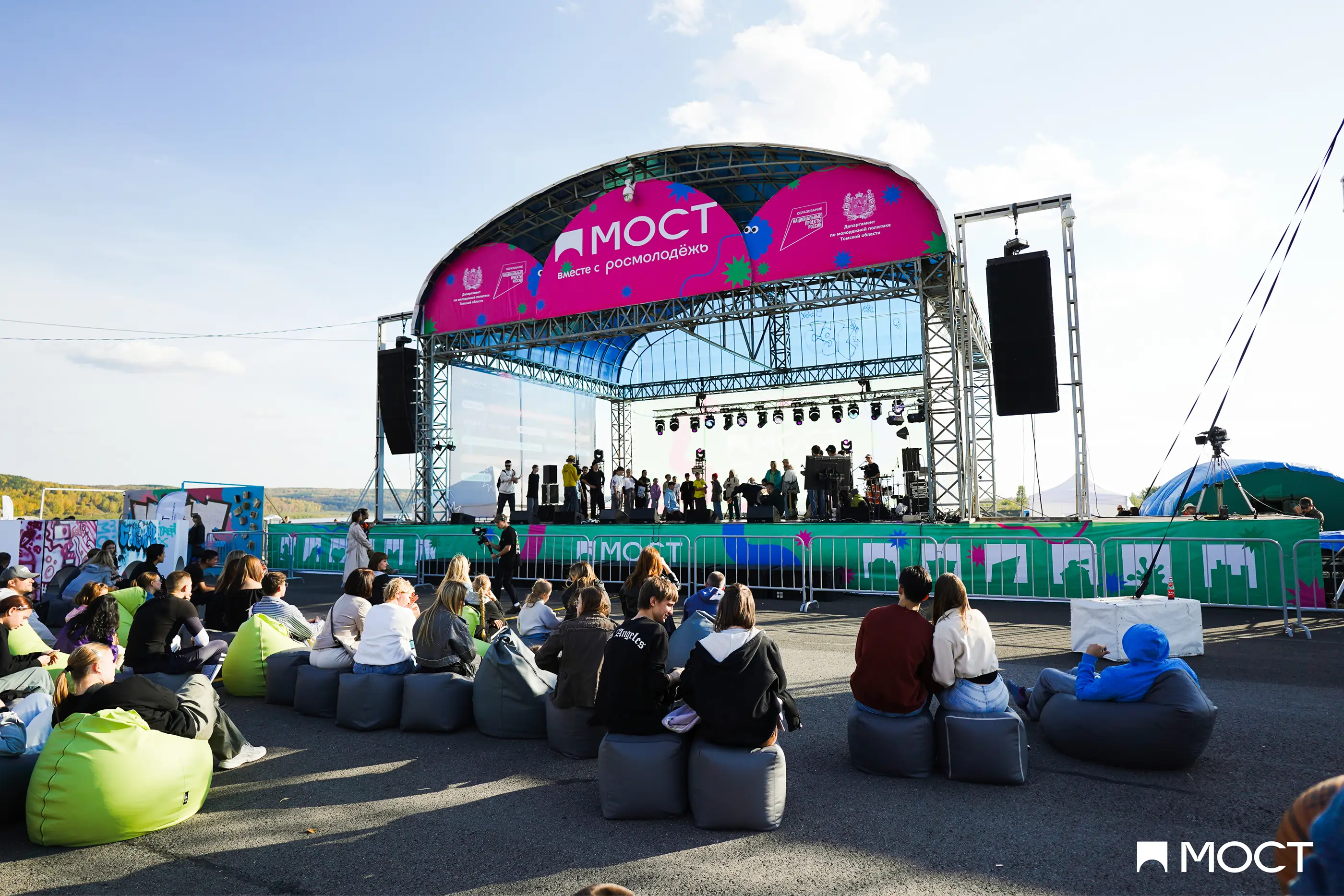
For the stage I designed:
3 stage skirt layouts;
3 stage header layouts;
2 side banner layouts.

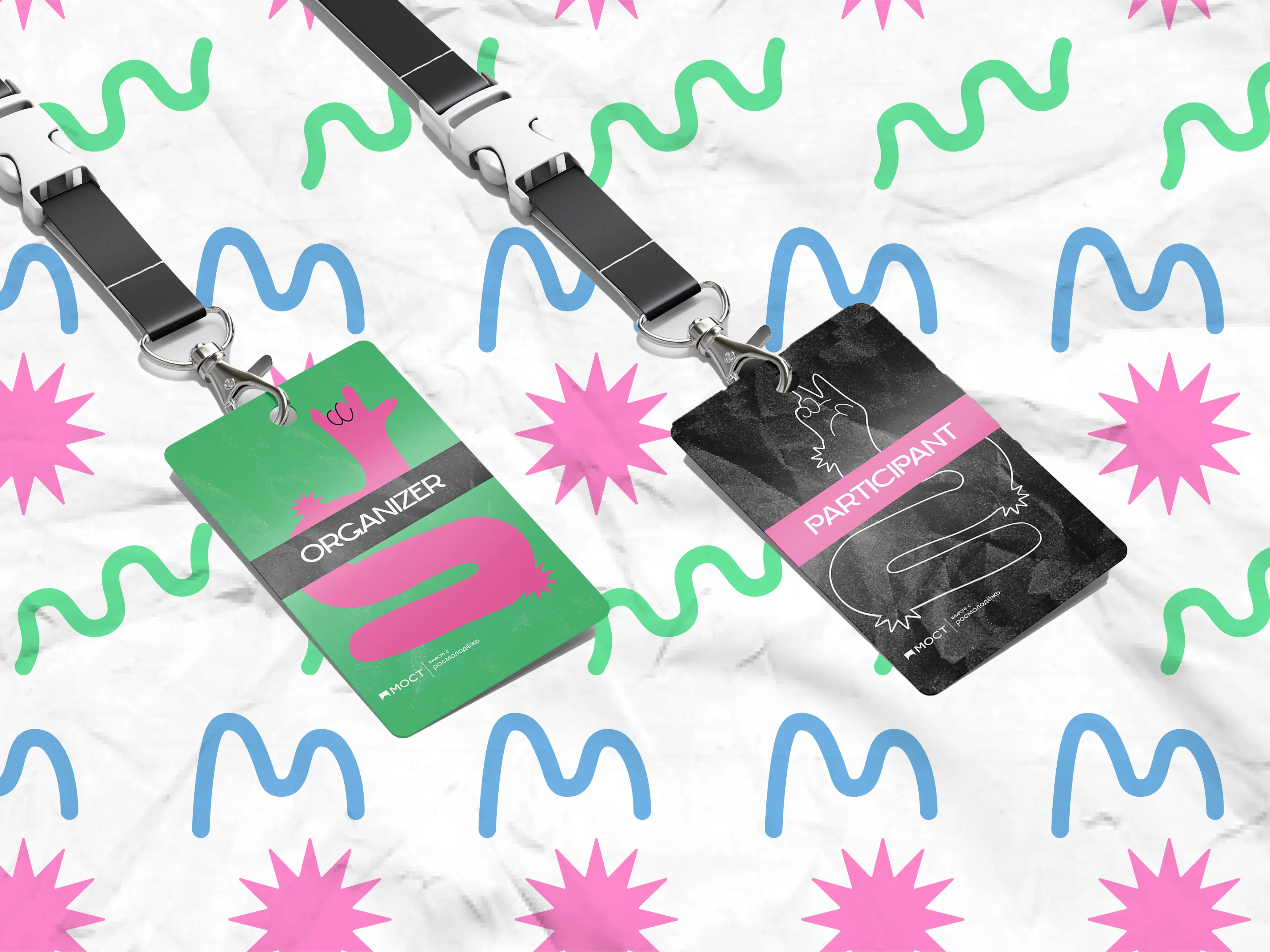
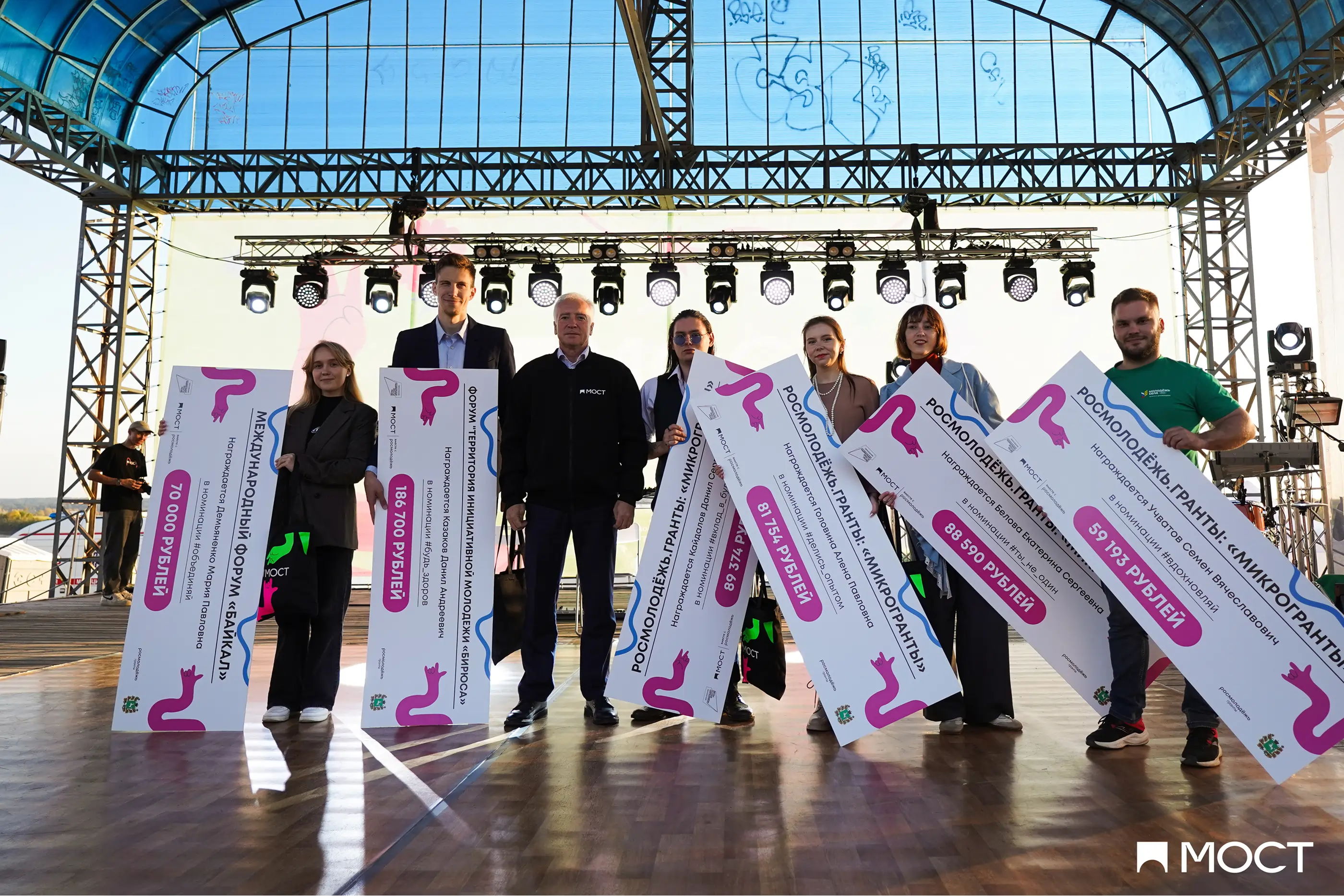
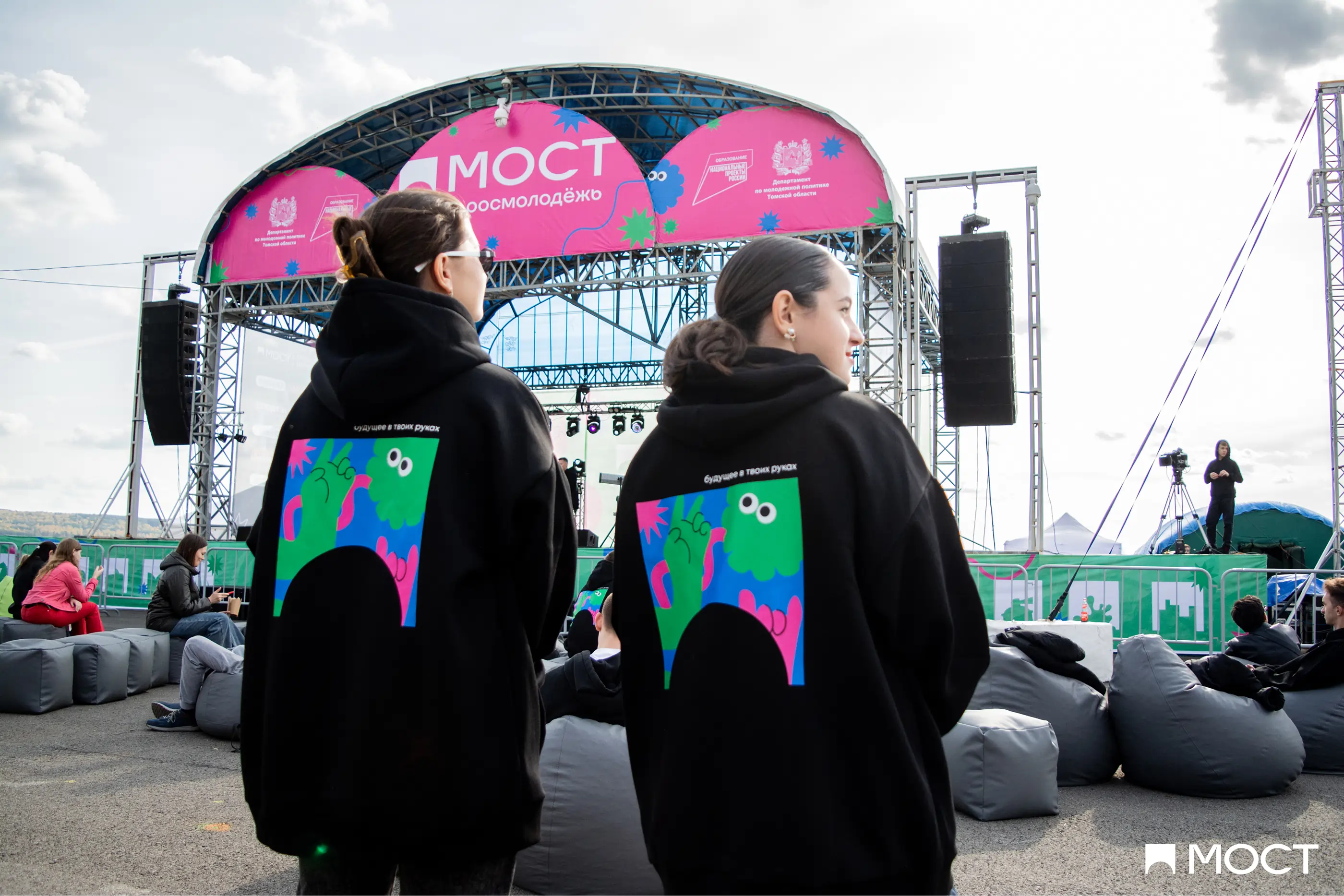
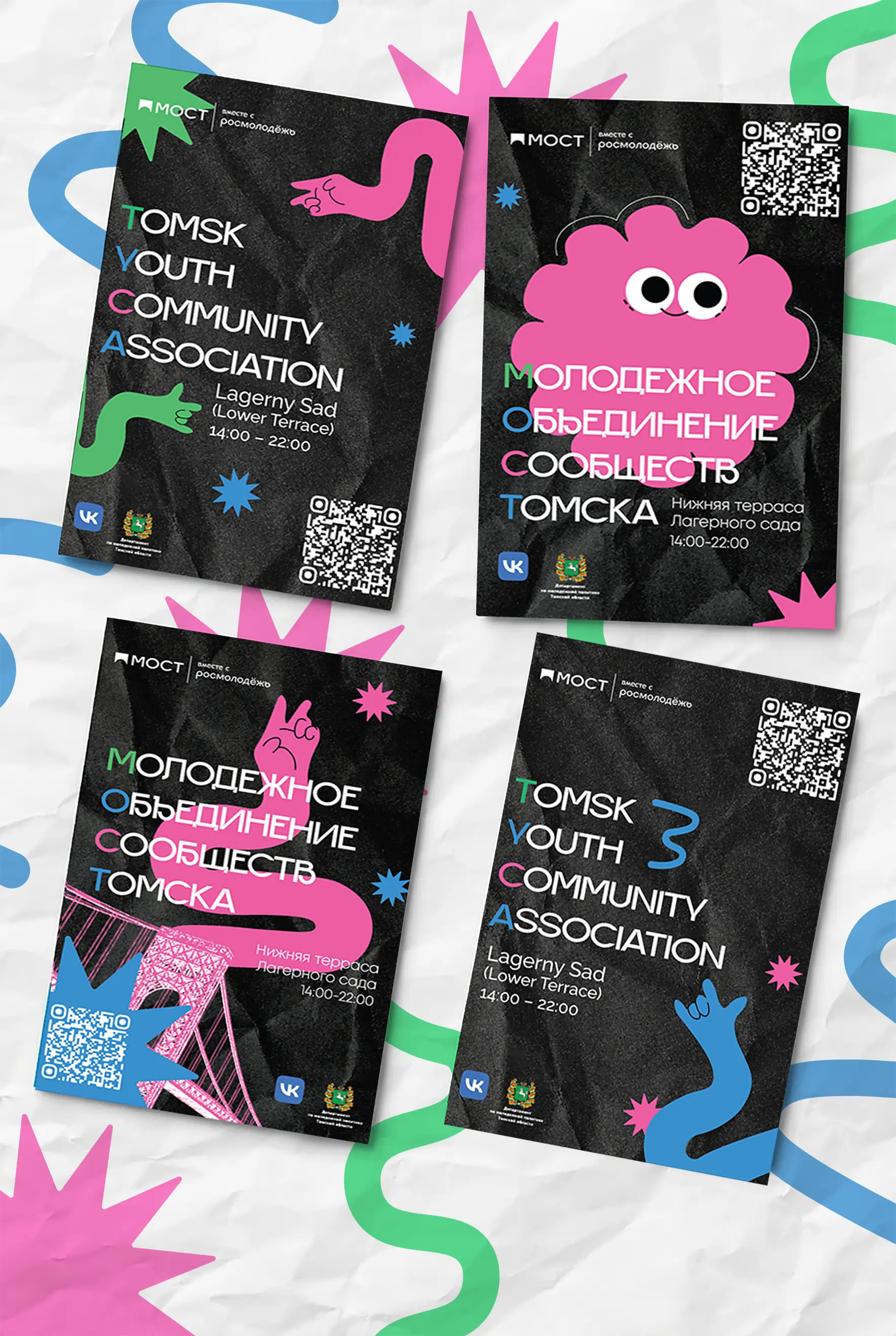
Another major part of the project was print production: mainly billboard and poster layouts in different formats. Here you can see reward cheques, ID cards for organizers and participants, and a branded hoodie.
Digital materials
I also created social posts and stories for VK social platform





















For animations I used Adobe After Effects. The first animation was displayed on digital billboards as an ad, while the second was used as an on-site loop during the event.
Results
In total, I created over 100 social posts and stories, more than 15 banner/print layouts, and 2 animations. Here's some results:
Digital ads reached over 300,000 views;
Over 5,000 people registered for the event;
Approximately 10,000 people attended the event in a single day;
The identity is still in use today, but they made some changes.